
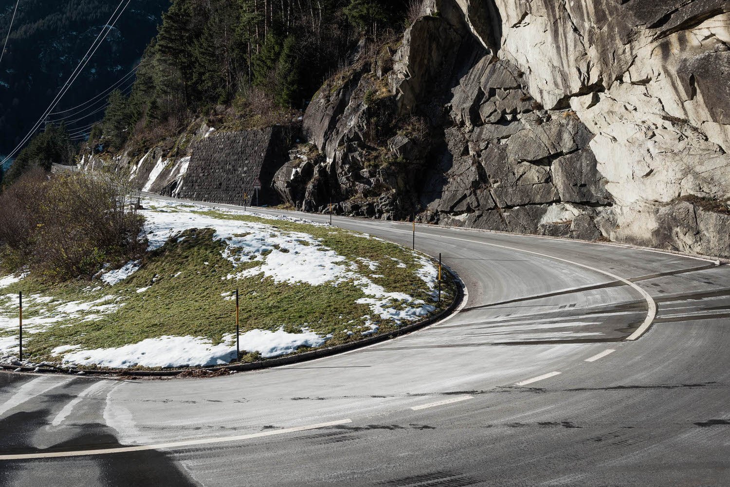
Just added
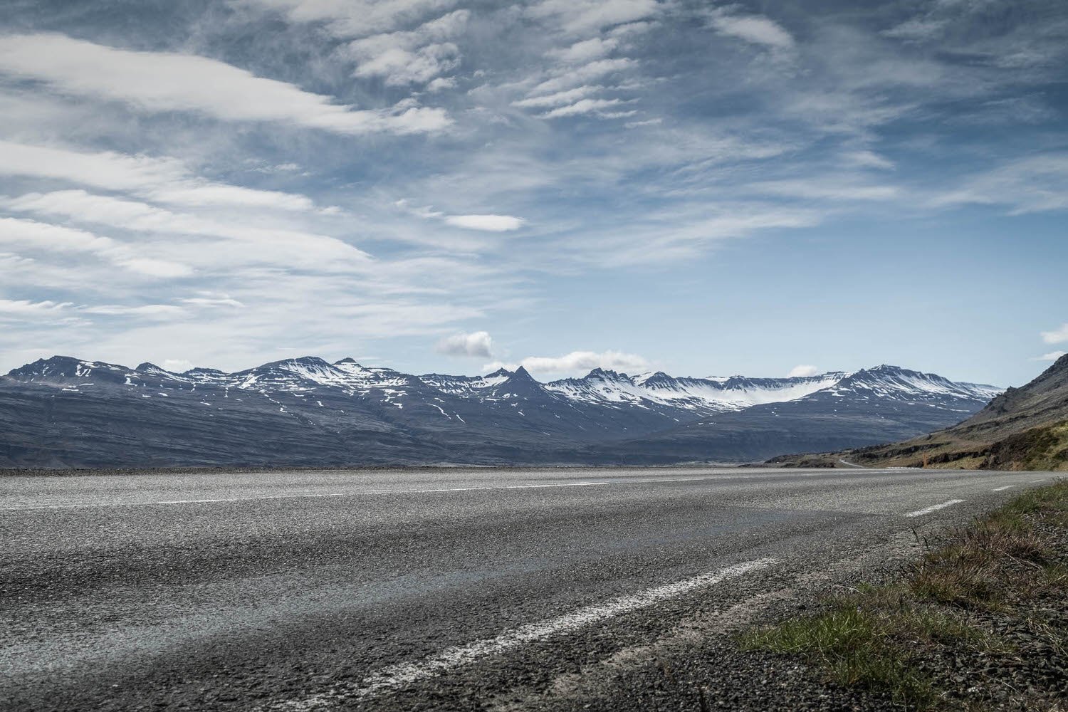
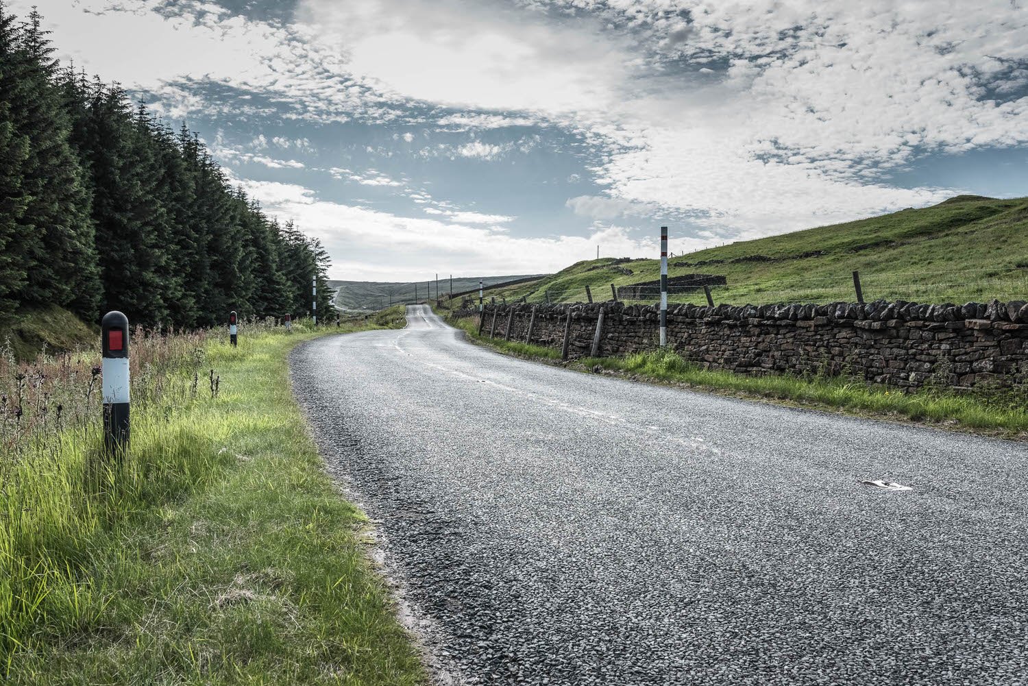
London lifestyle, rainy city streets & rugged landscapes.

Featured Locations

Just added
London lifestyle, rainy city streets & rugged landscapes.
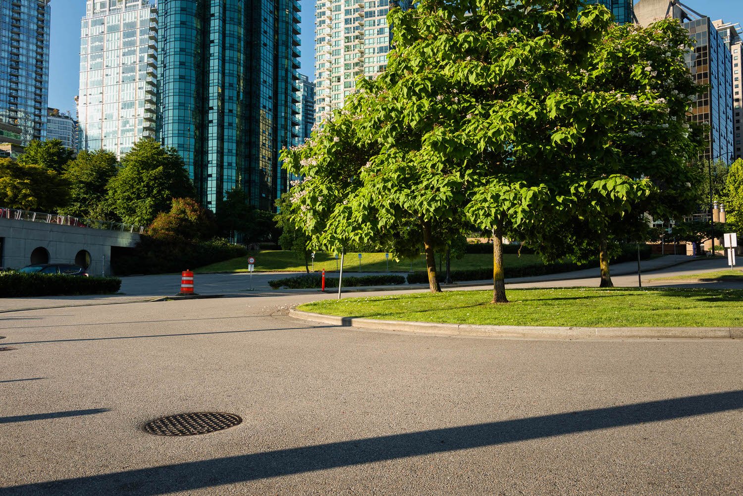
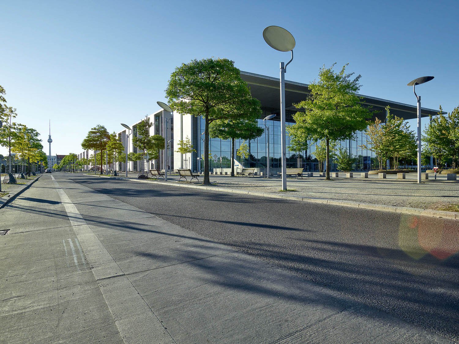
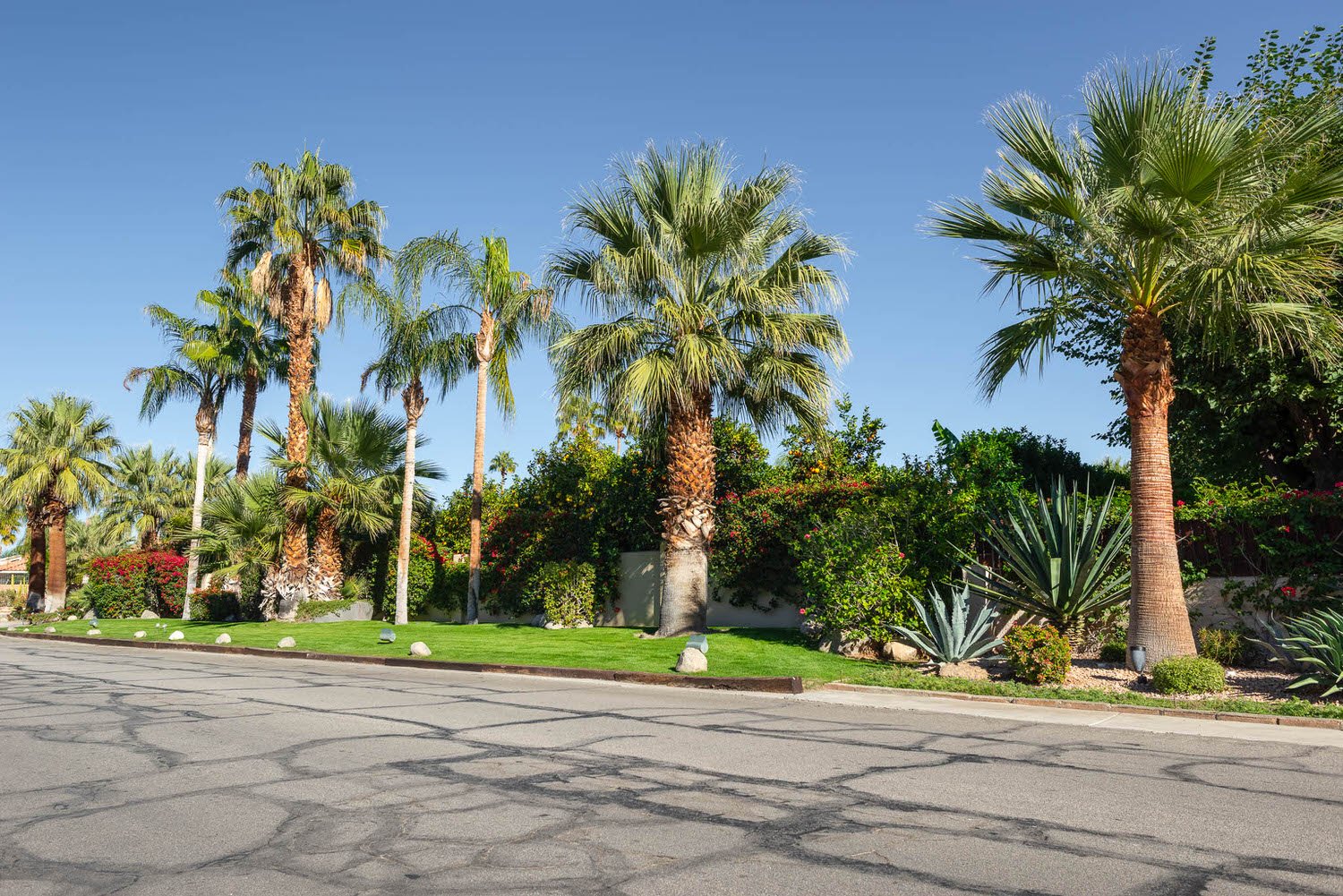
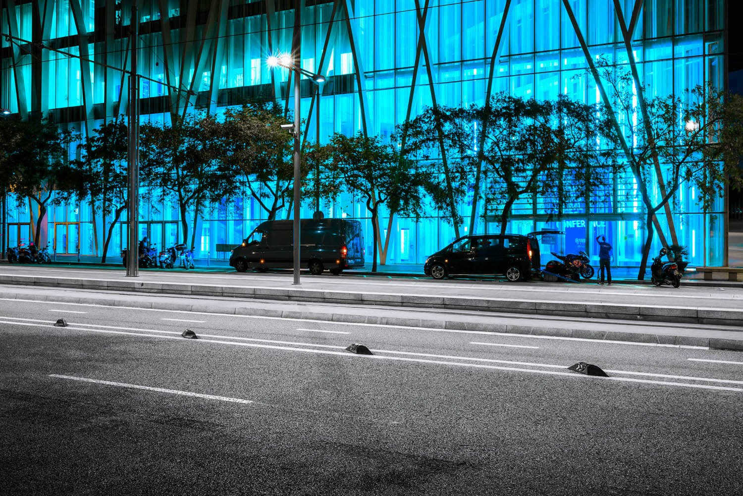
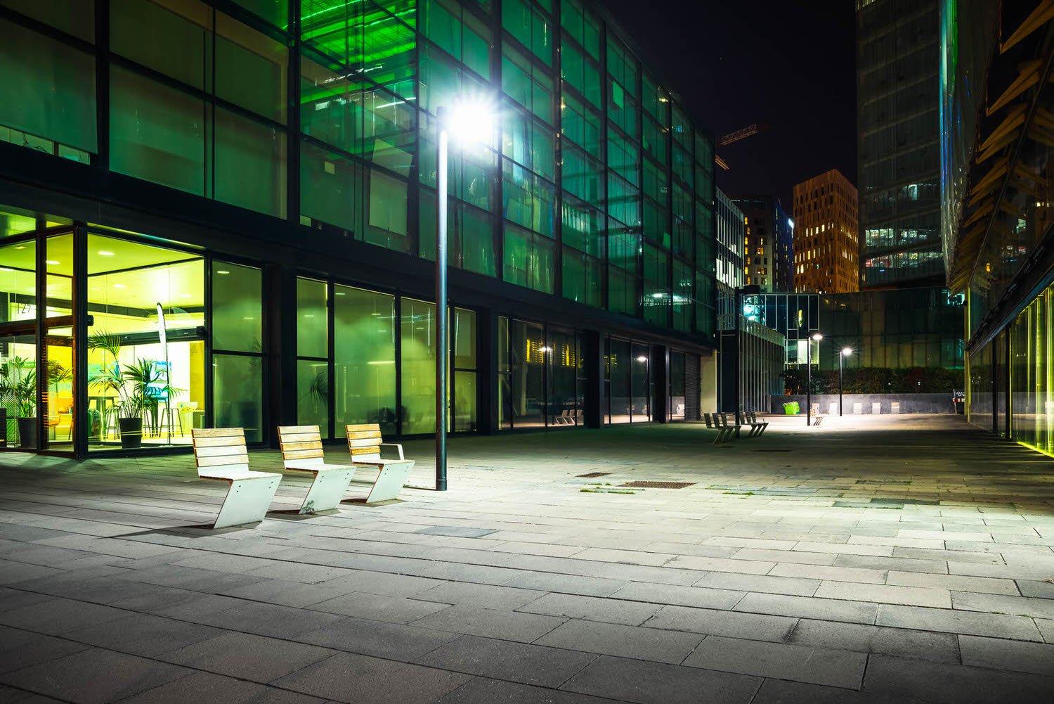
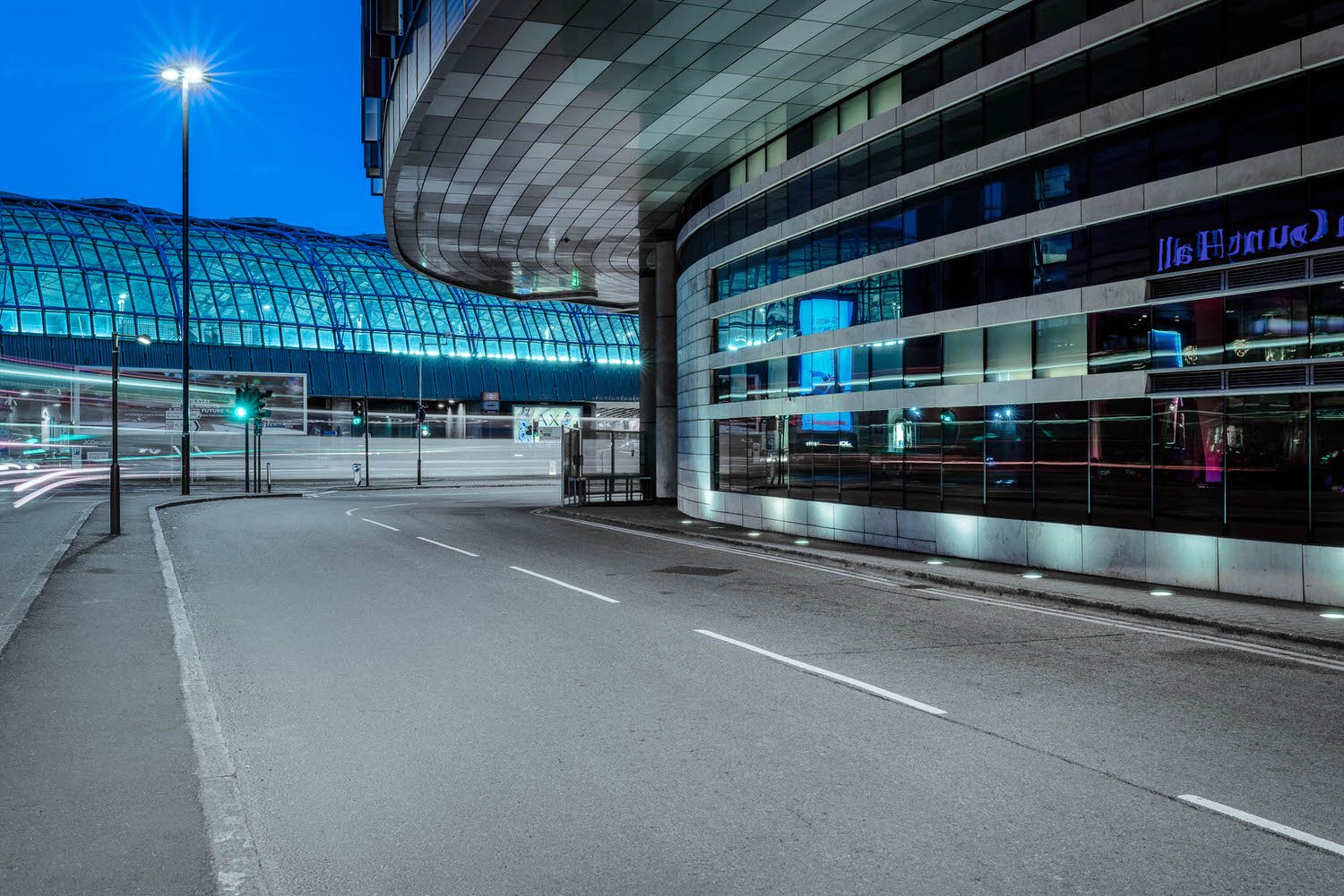
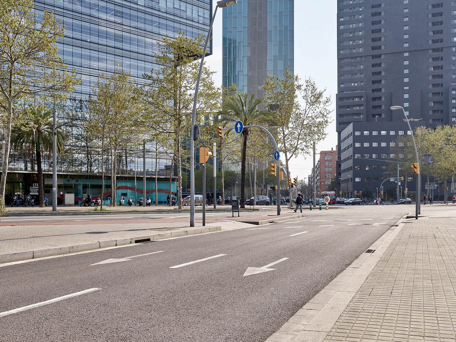
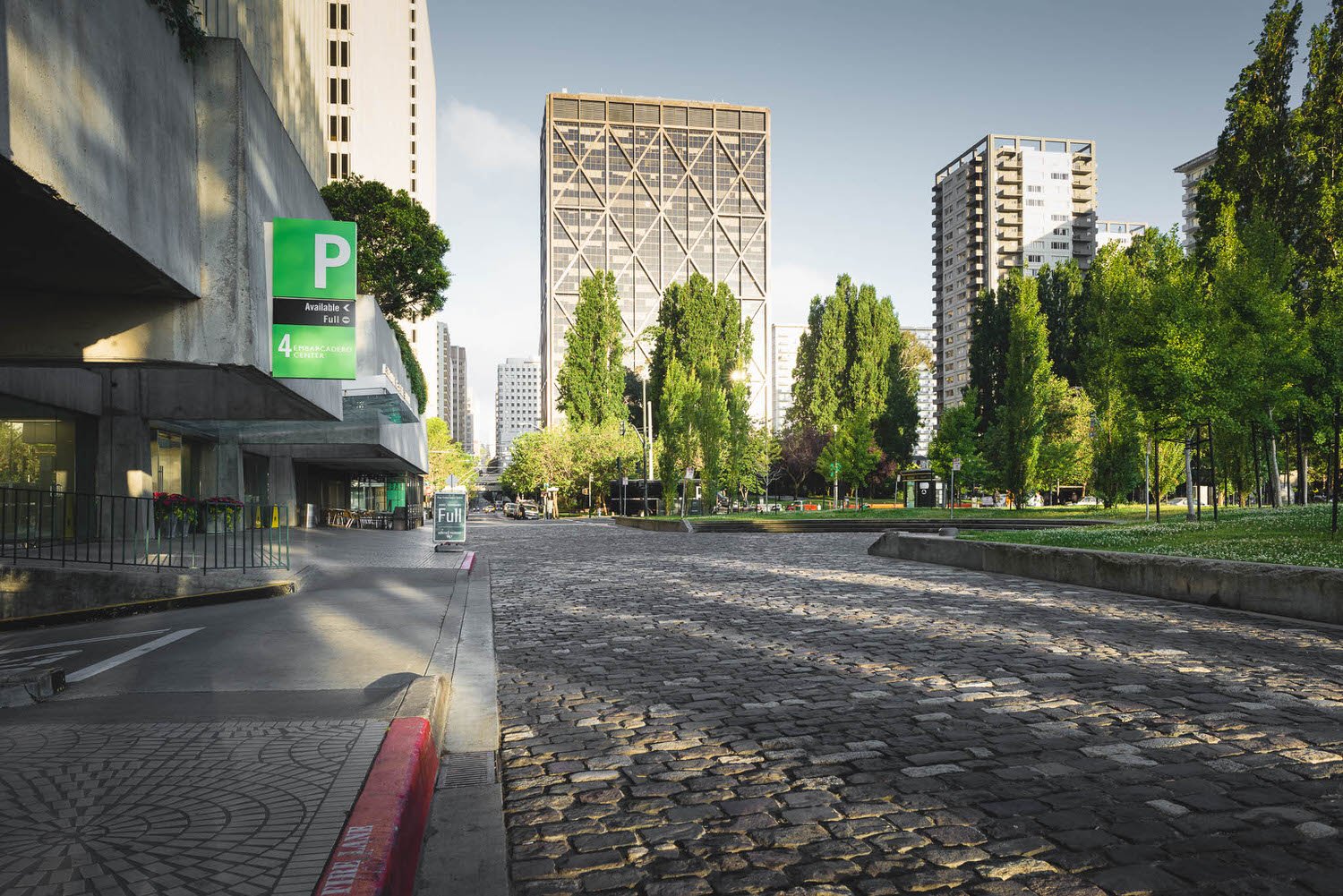
Colour Clash
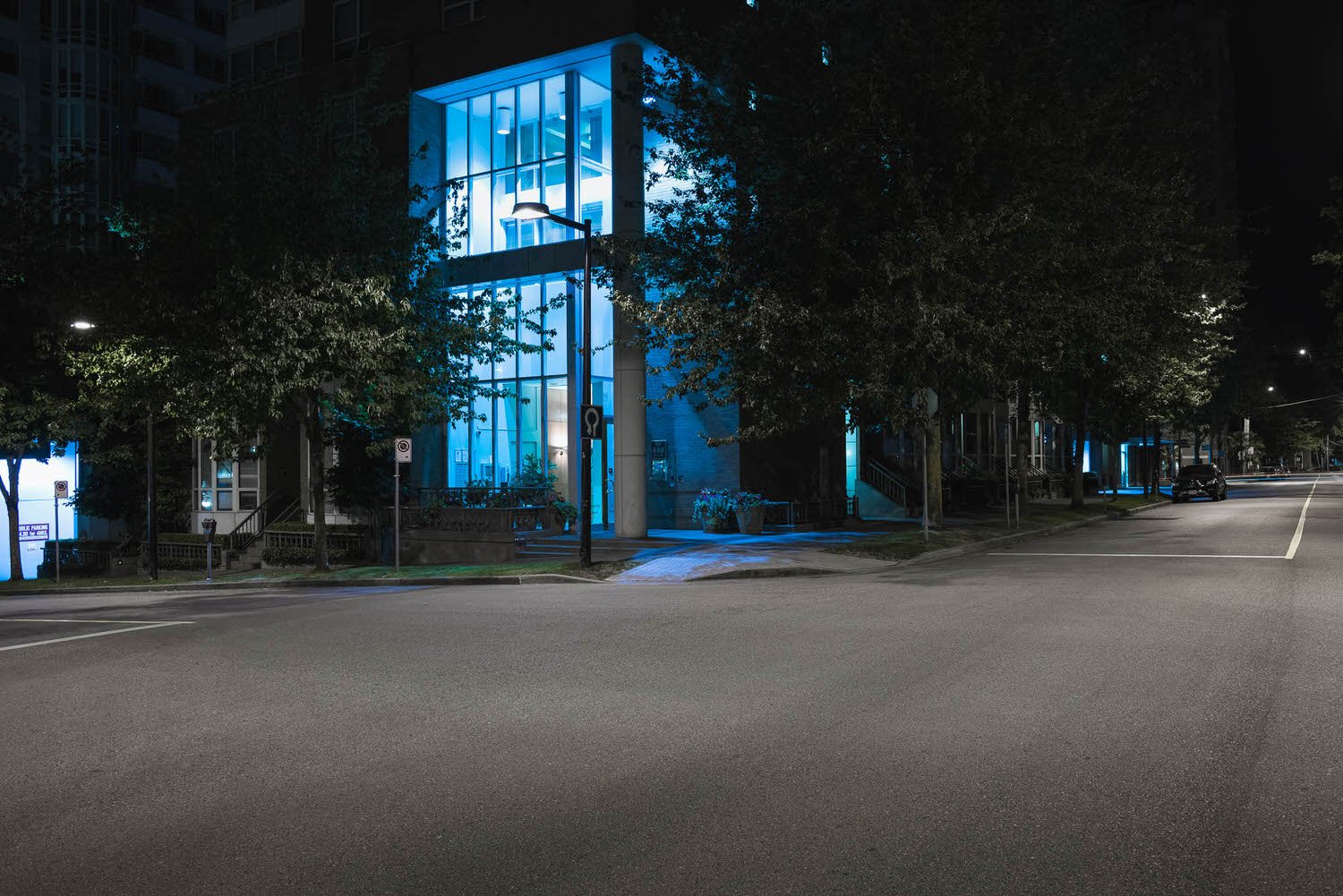
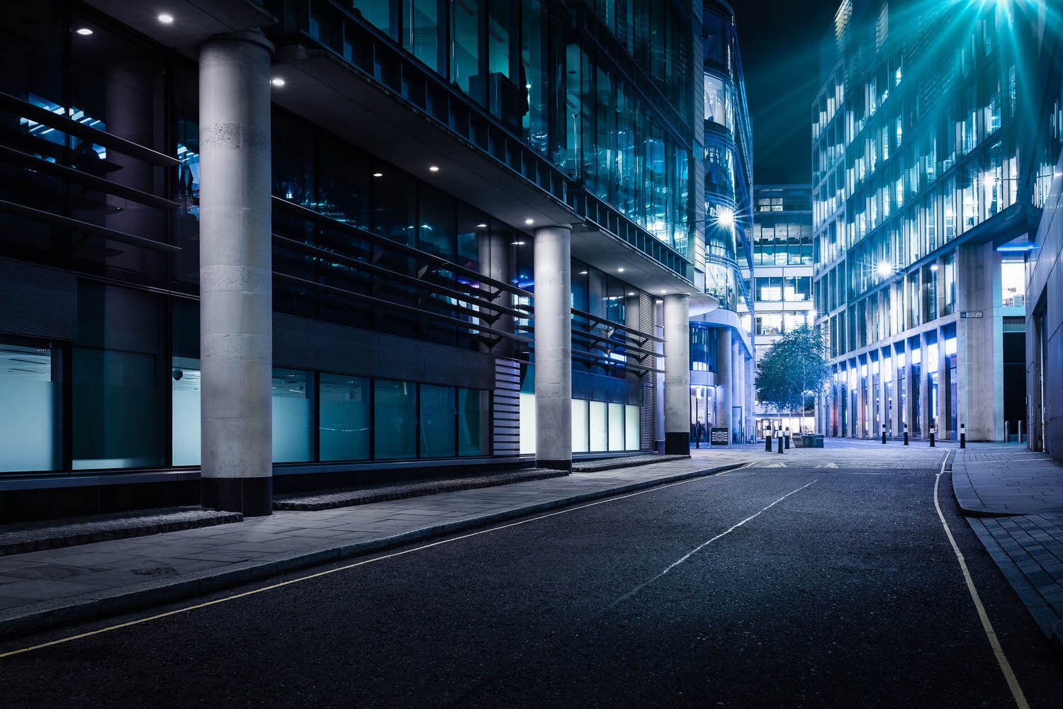
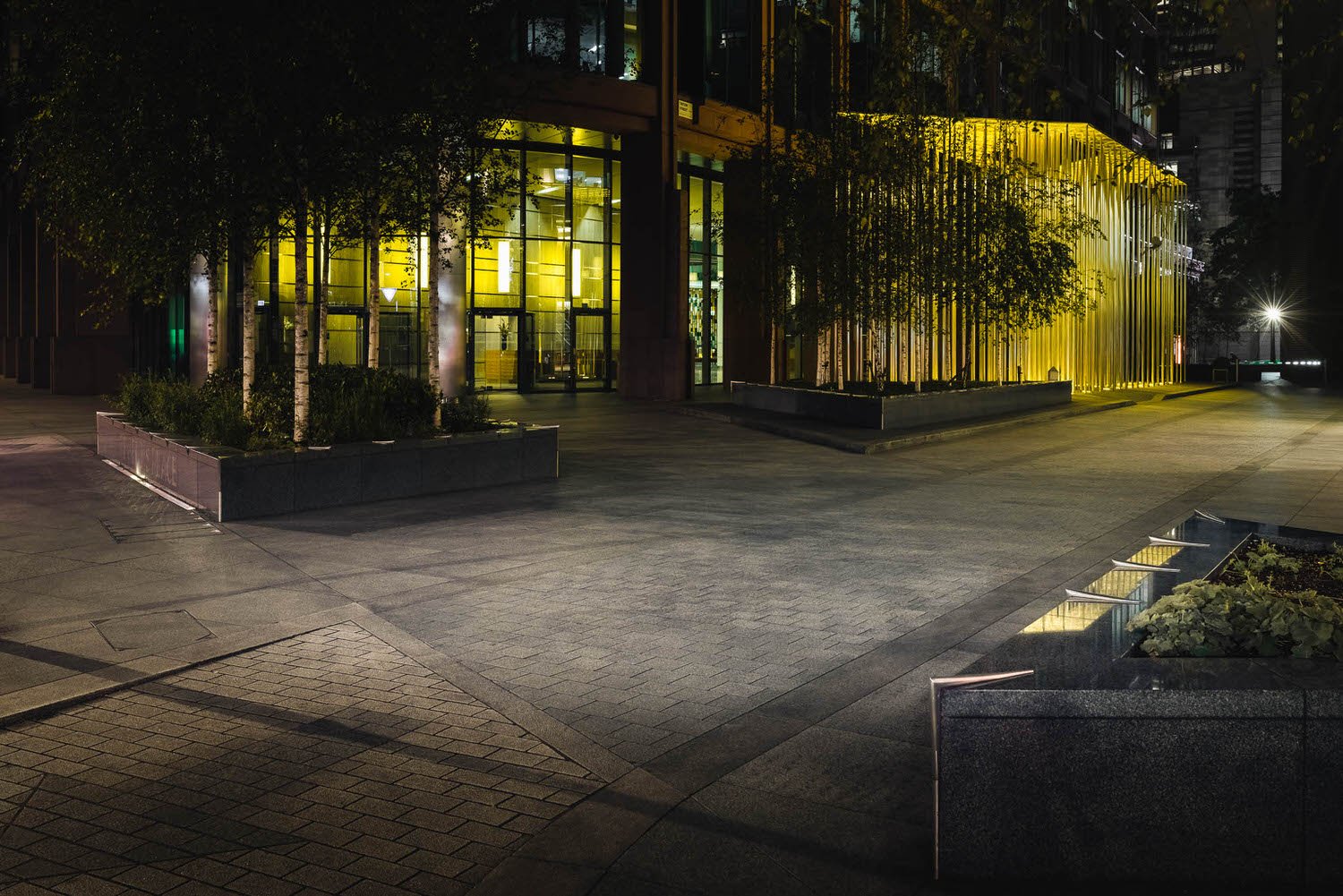
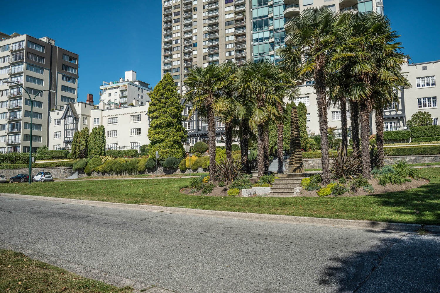
They say ‘blue and green should never be seen without a colour in between’ and where that may apply to an outfit choice it certainly isn’t true for everything. I personally find the ‘clash’ between bright shades of verdigris and cyan very uplifting. Whether the clash of lush grass against a sunny sky or glistening glass next to an urban tree, I always appreciate seeing these tones together.


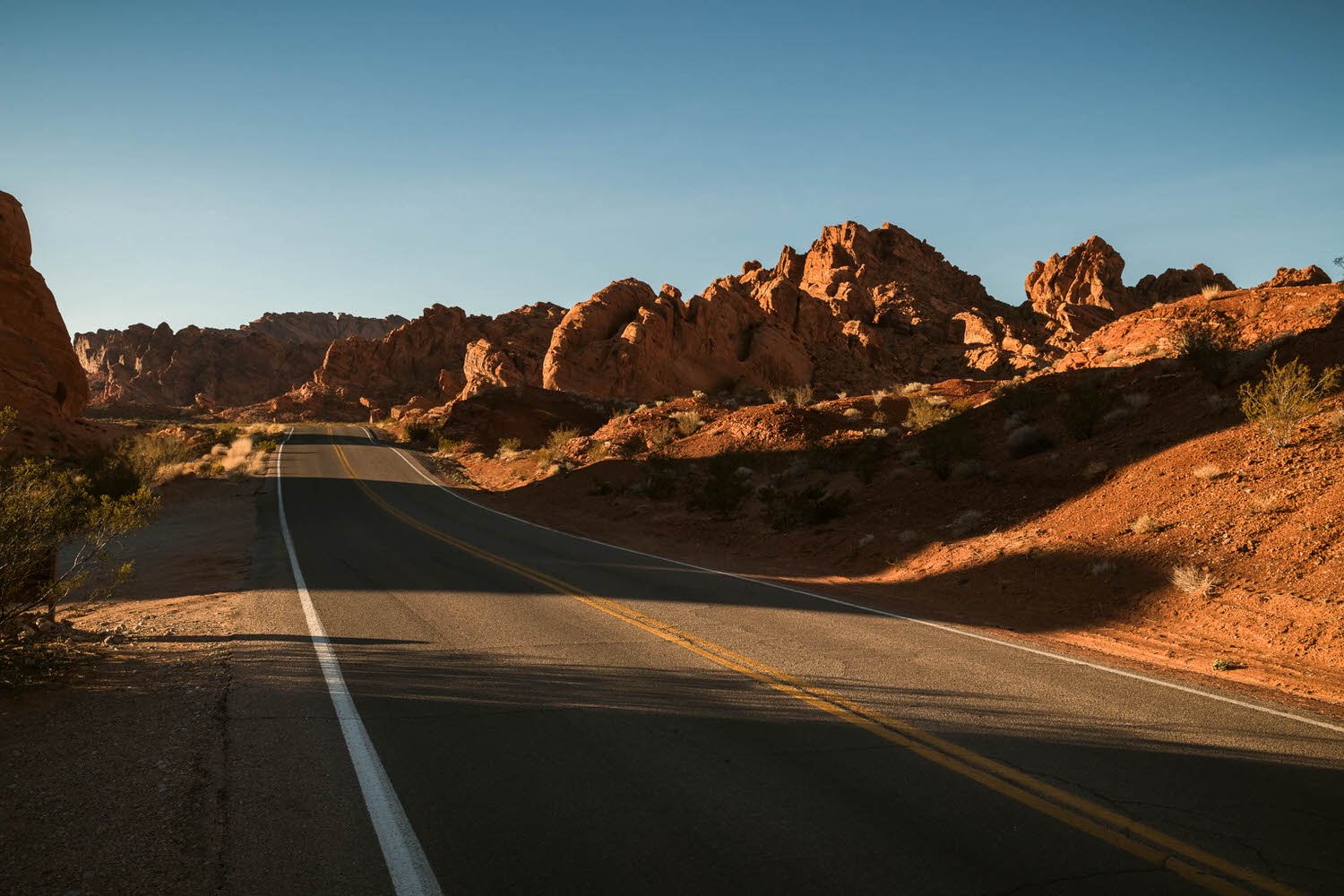
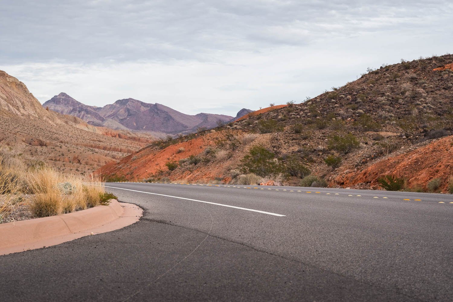
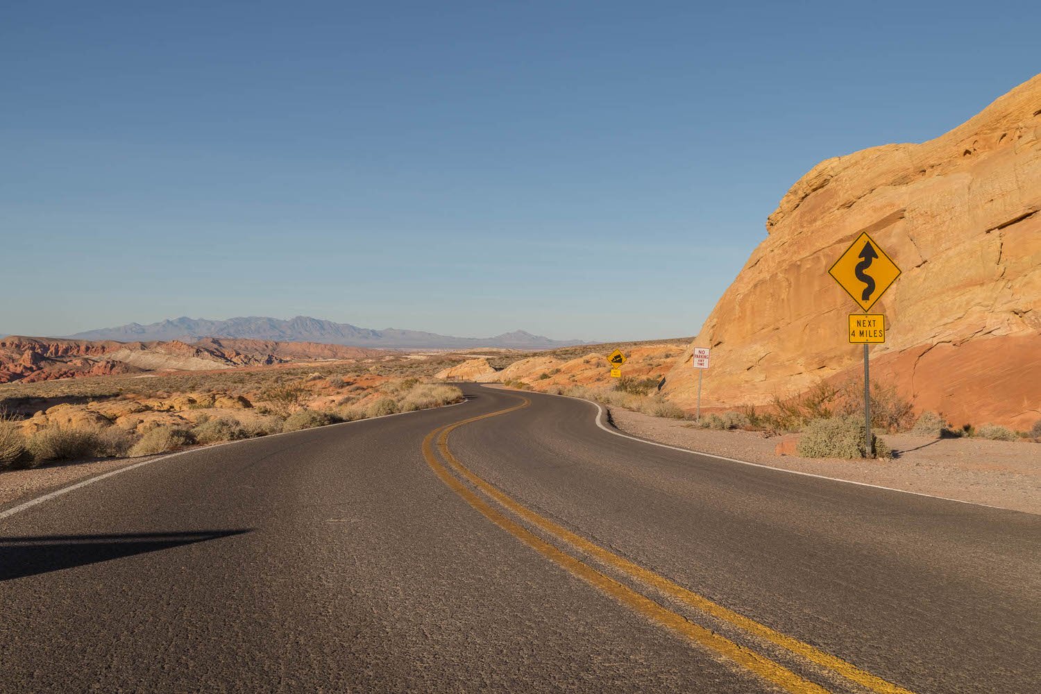
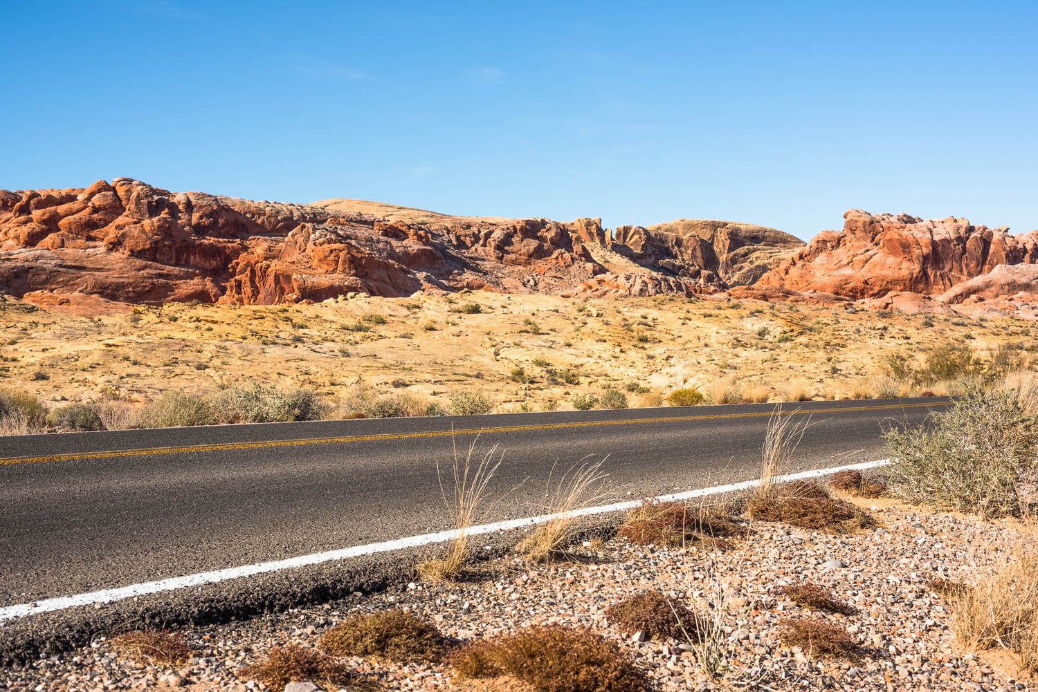
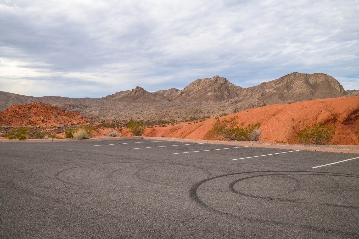
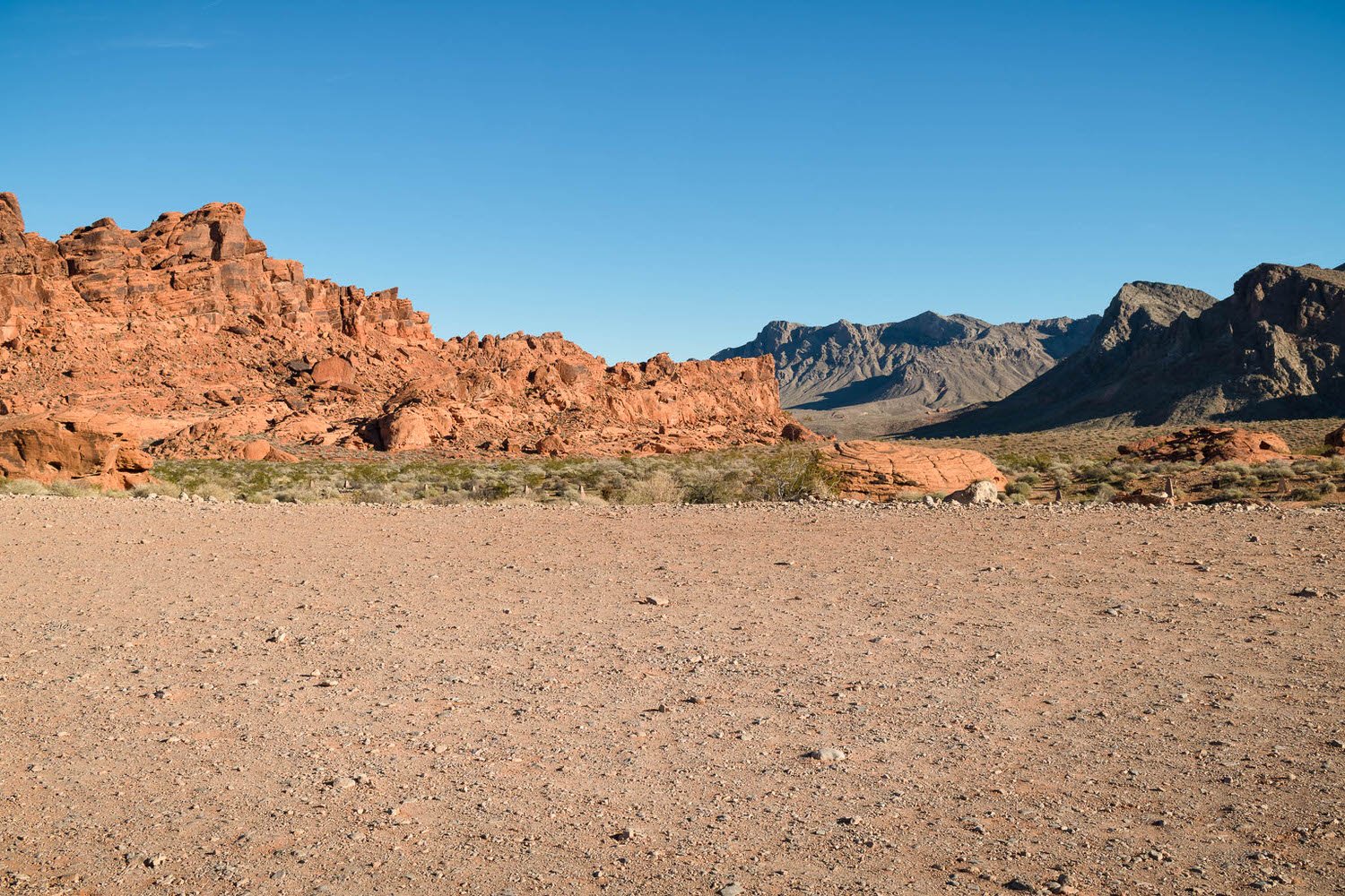
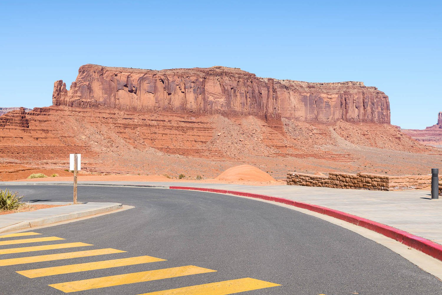
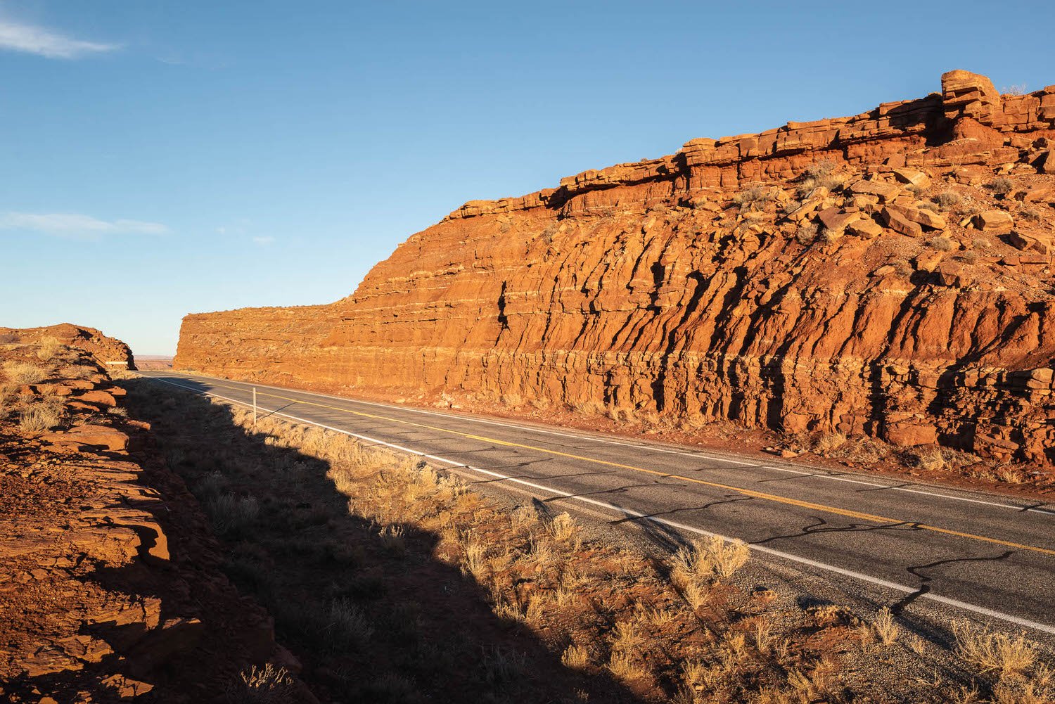
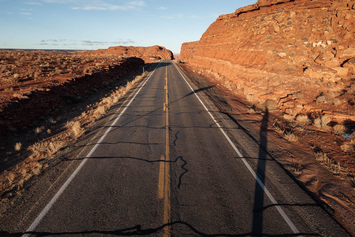
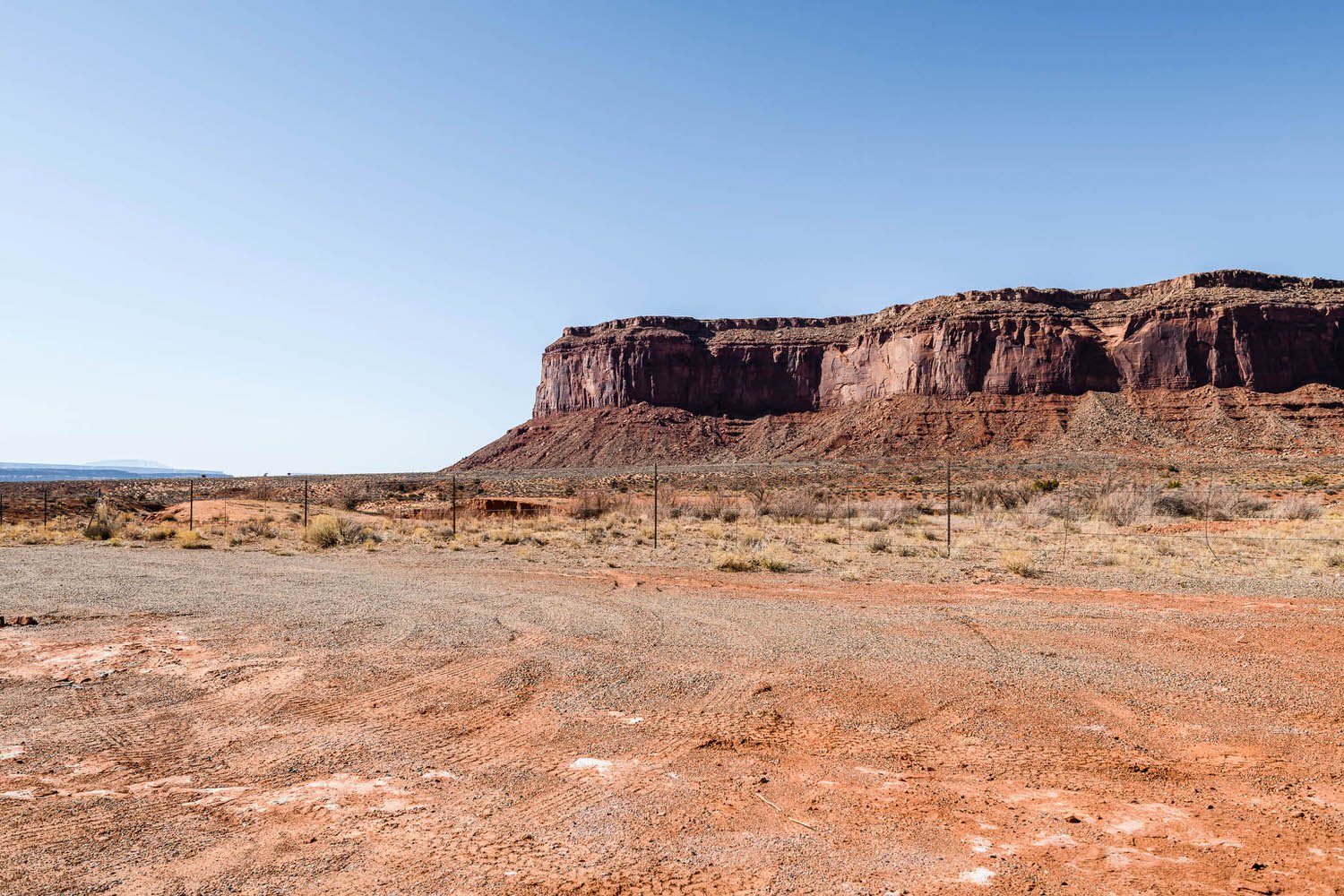
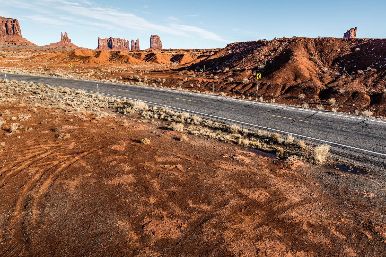
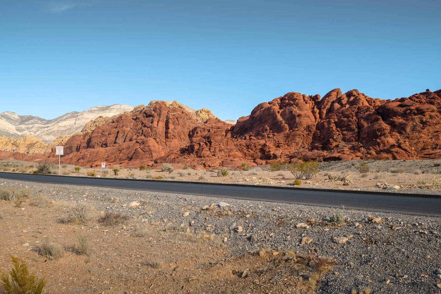
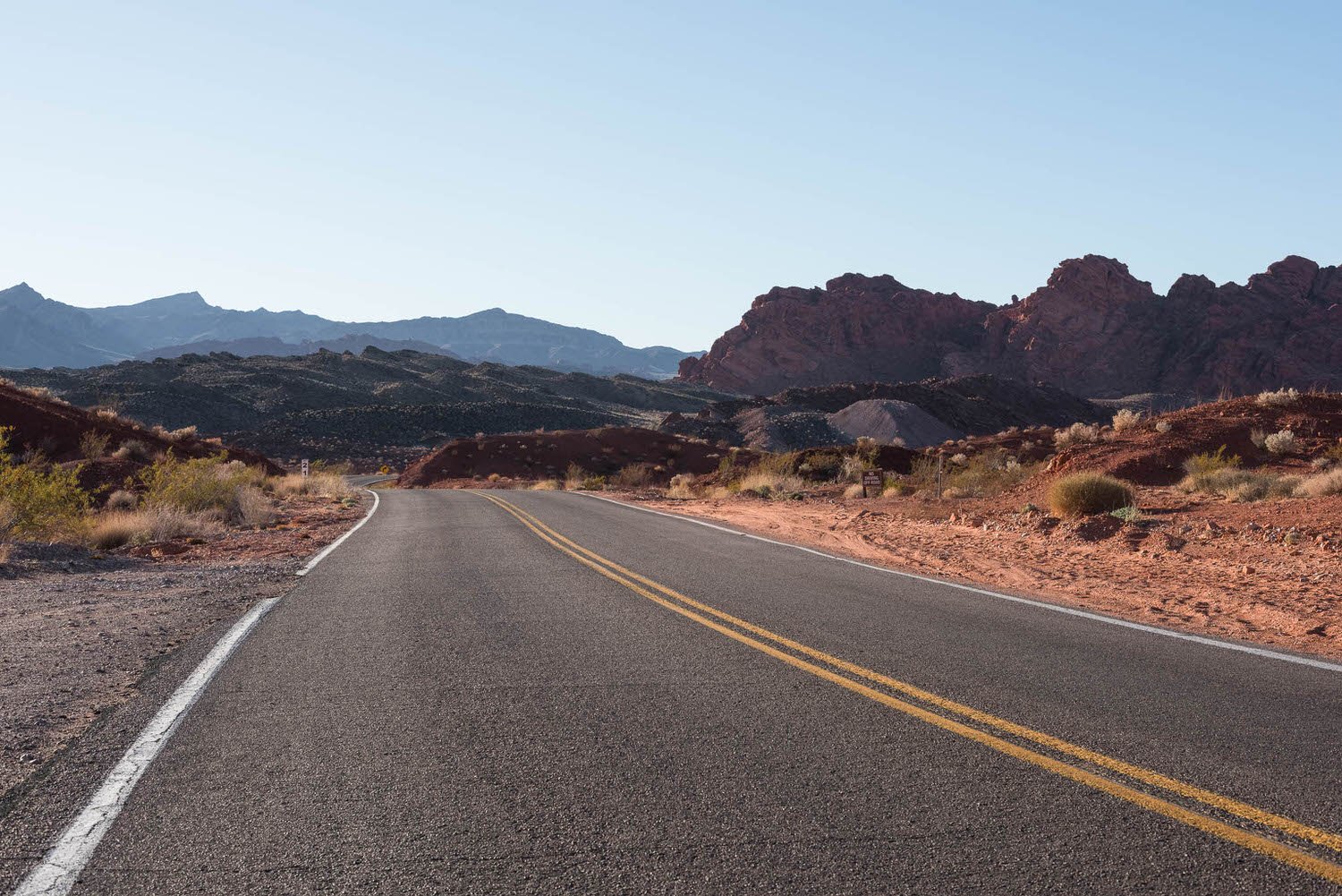
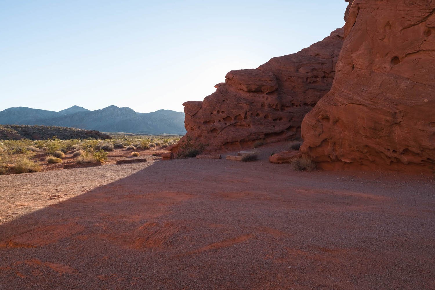
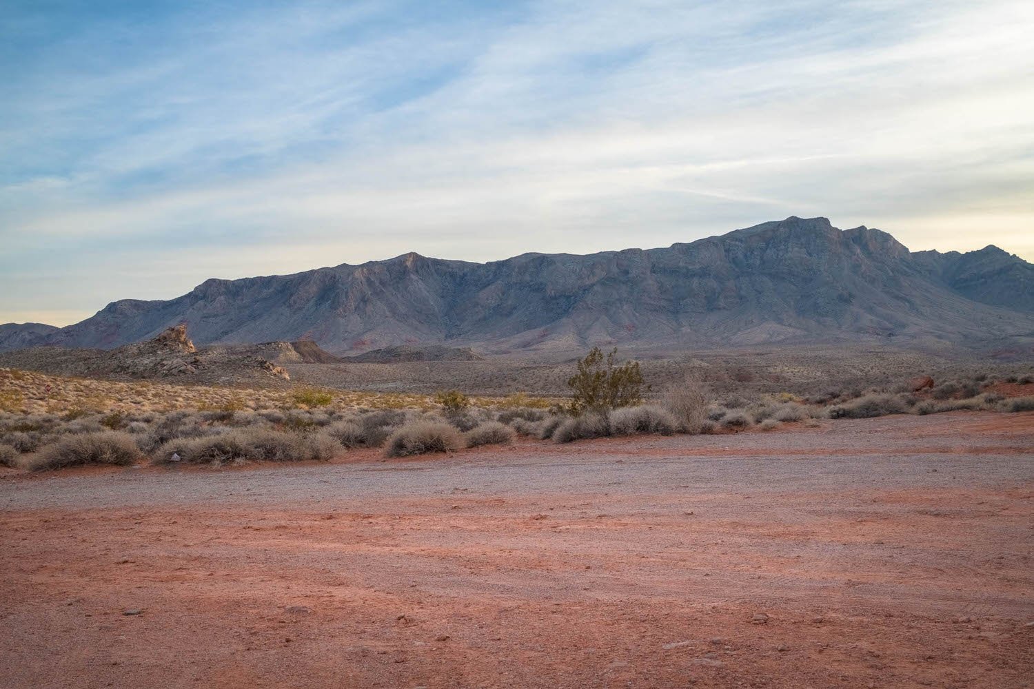
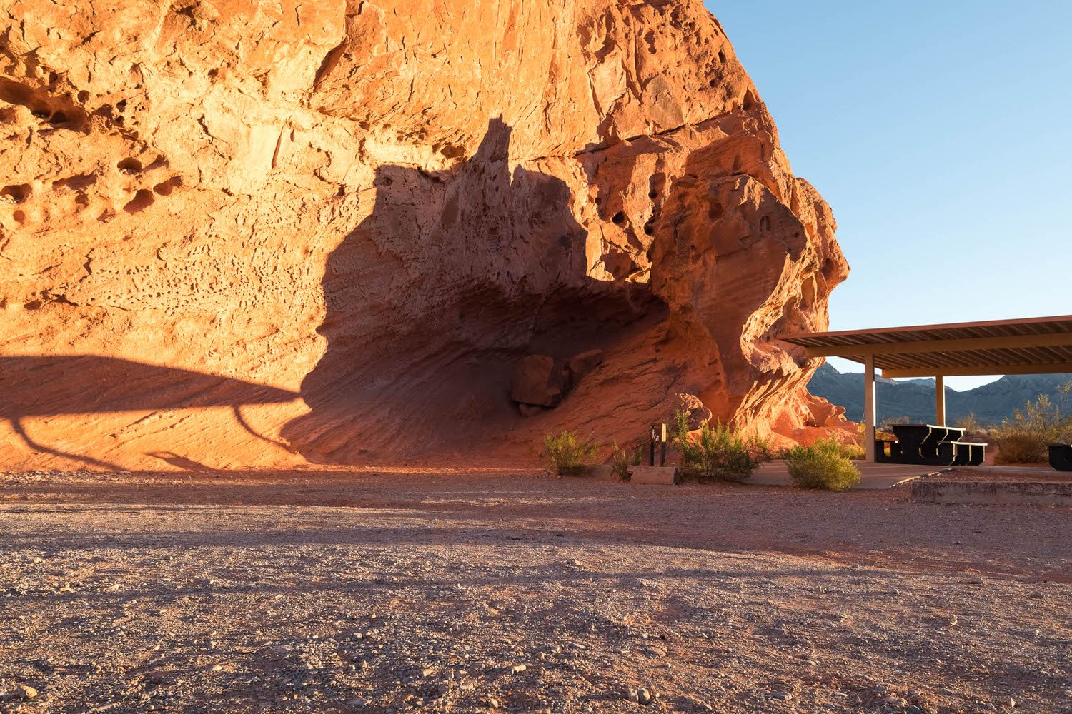
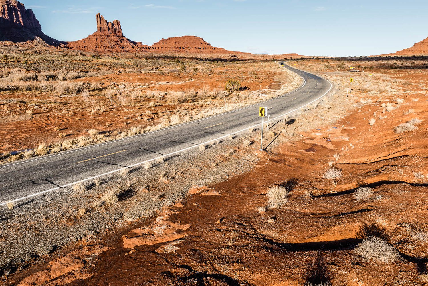
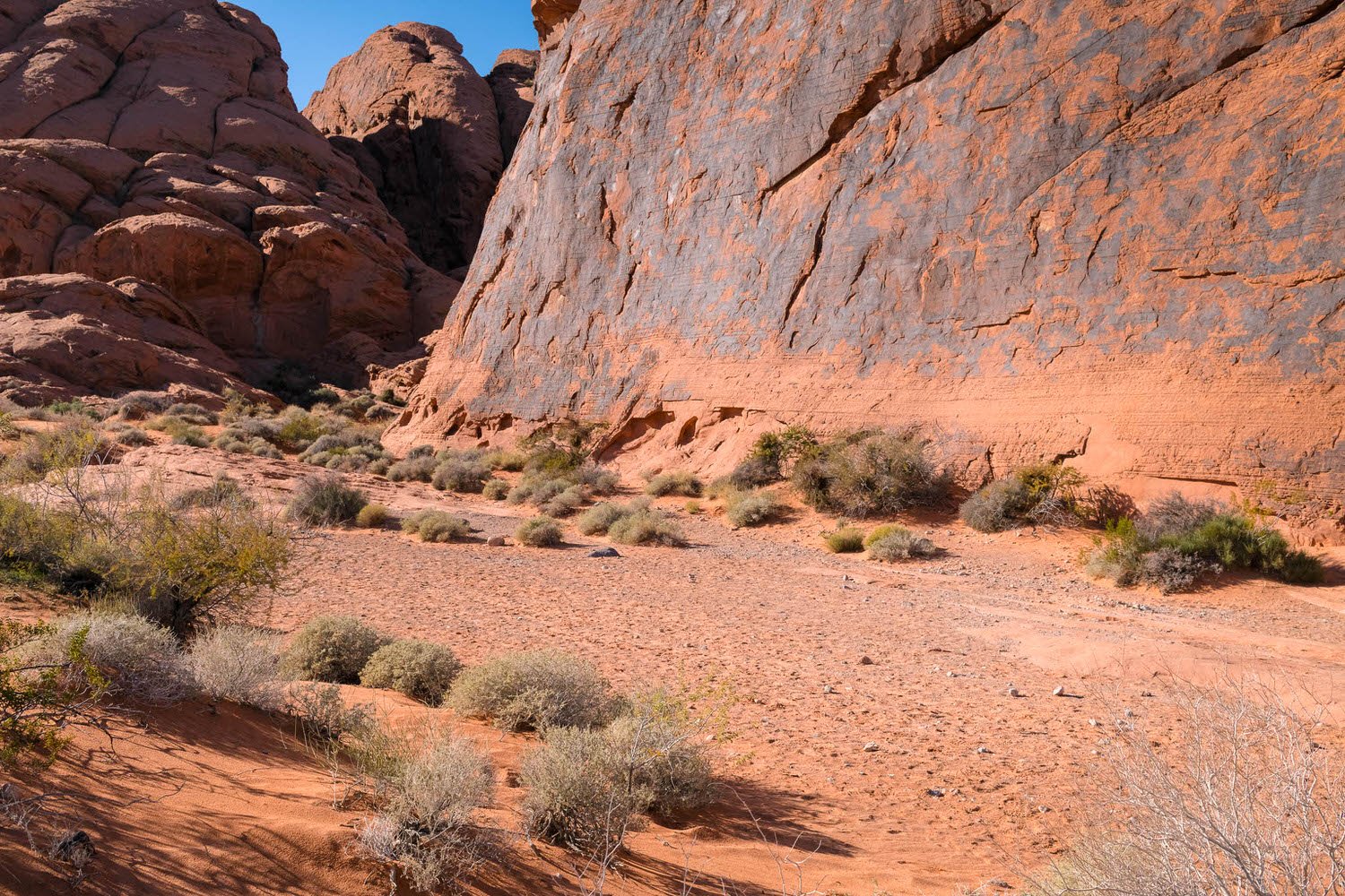
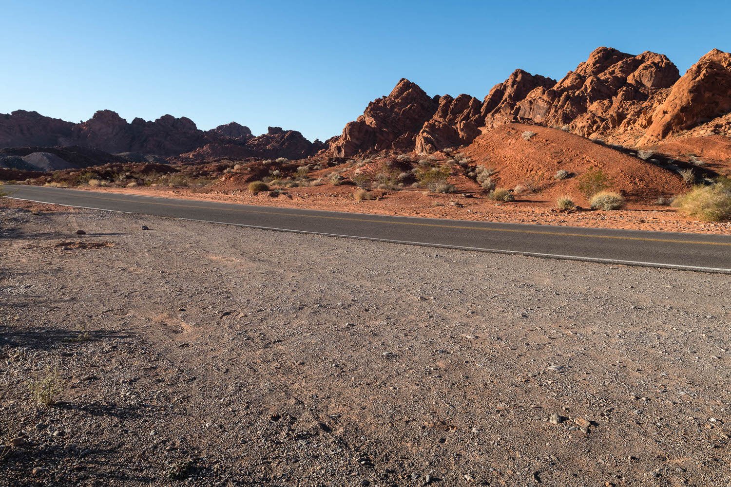
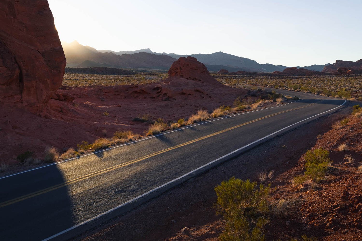
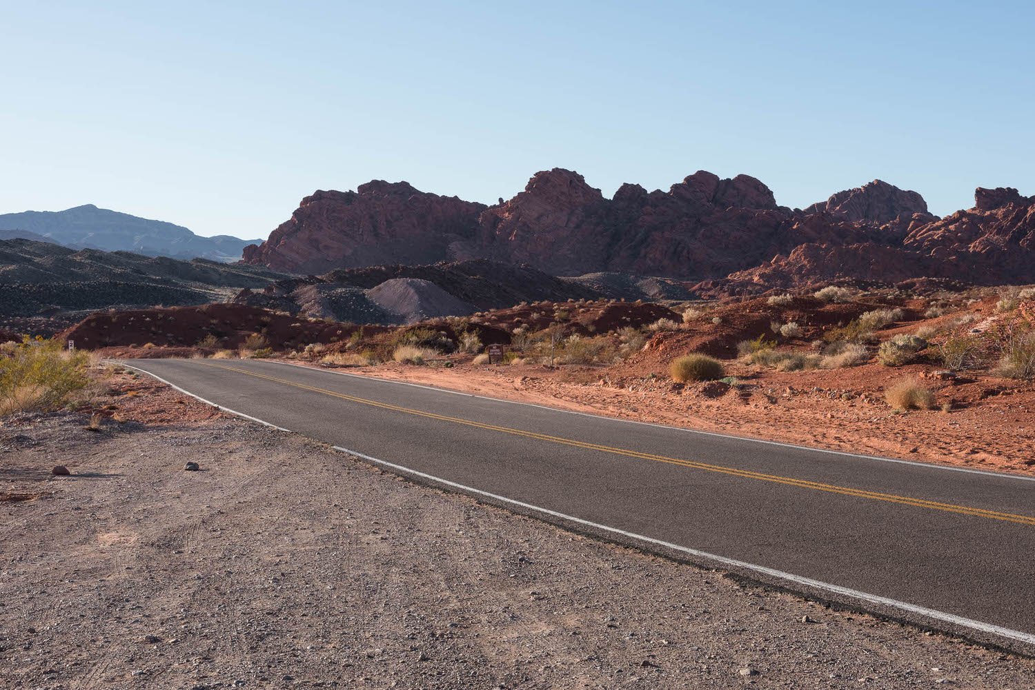
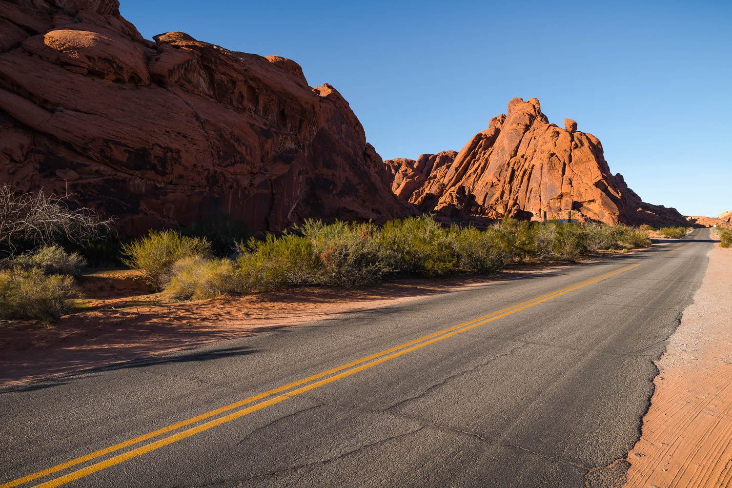
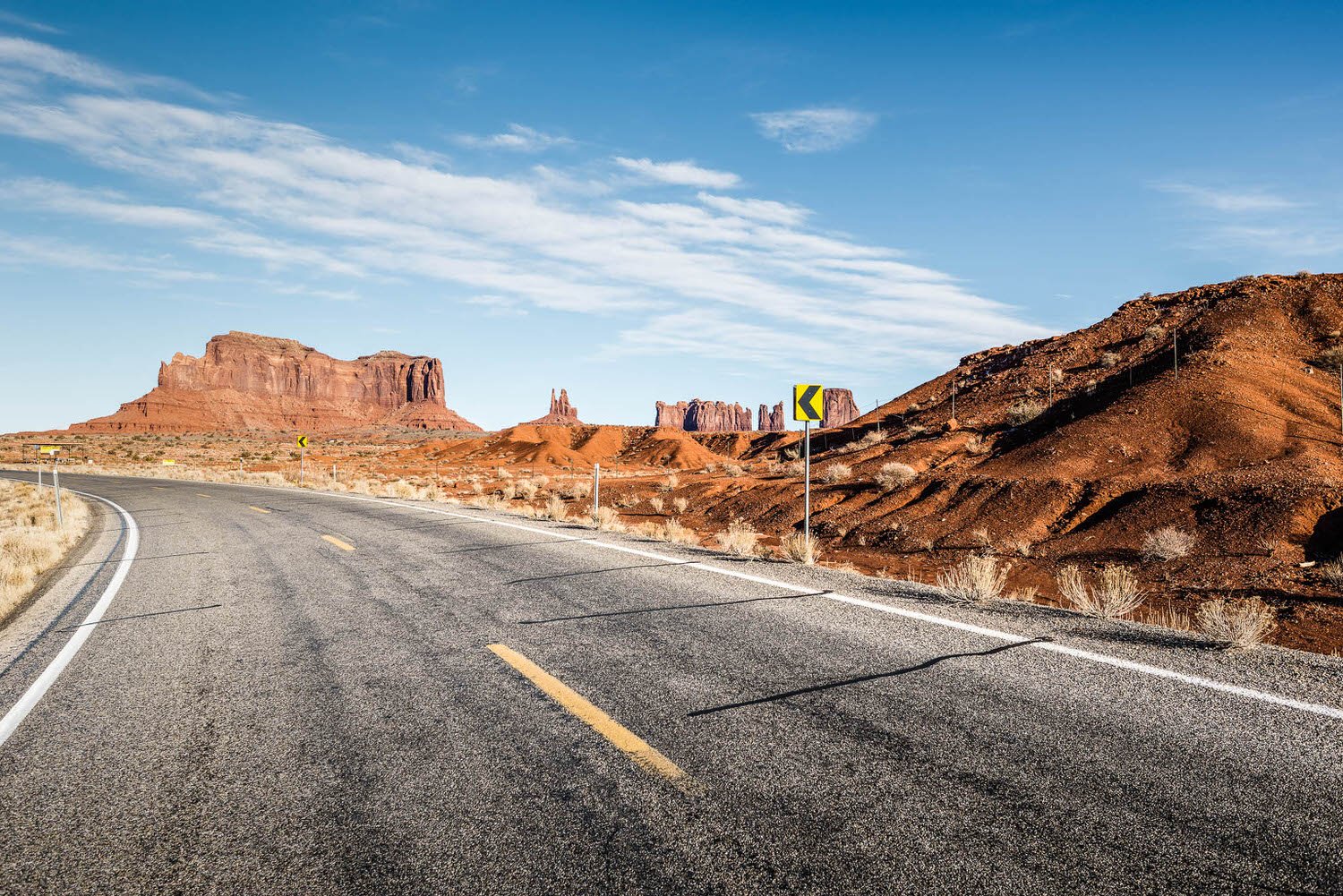
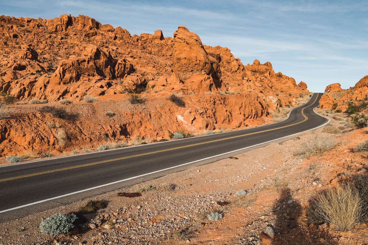
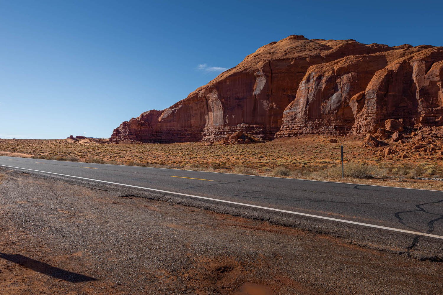
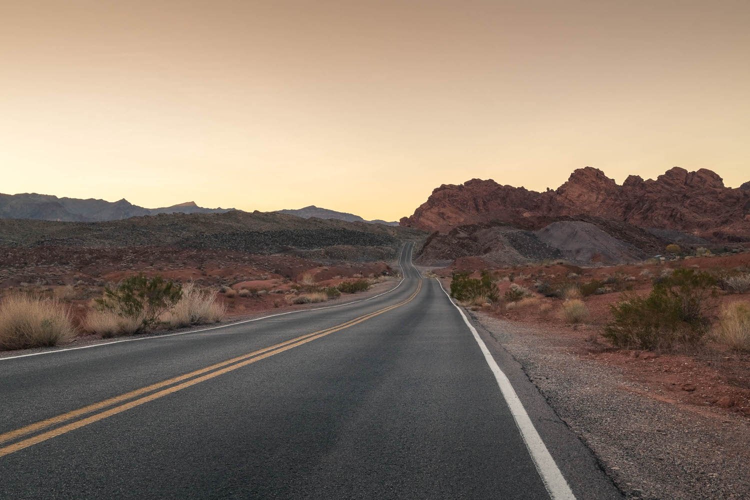
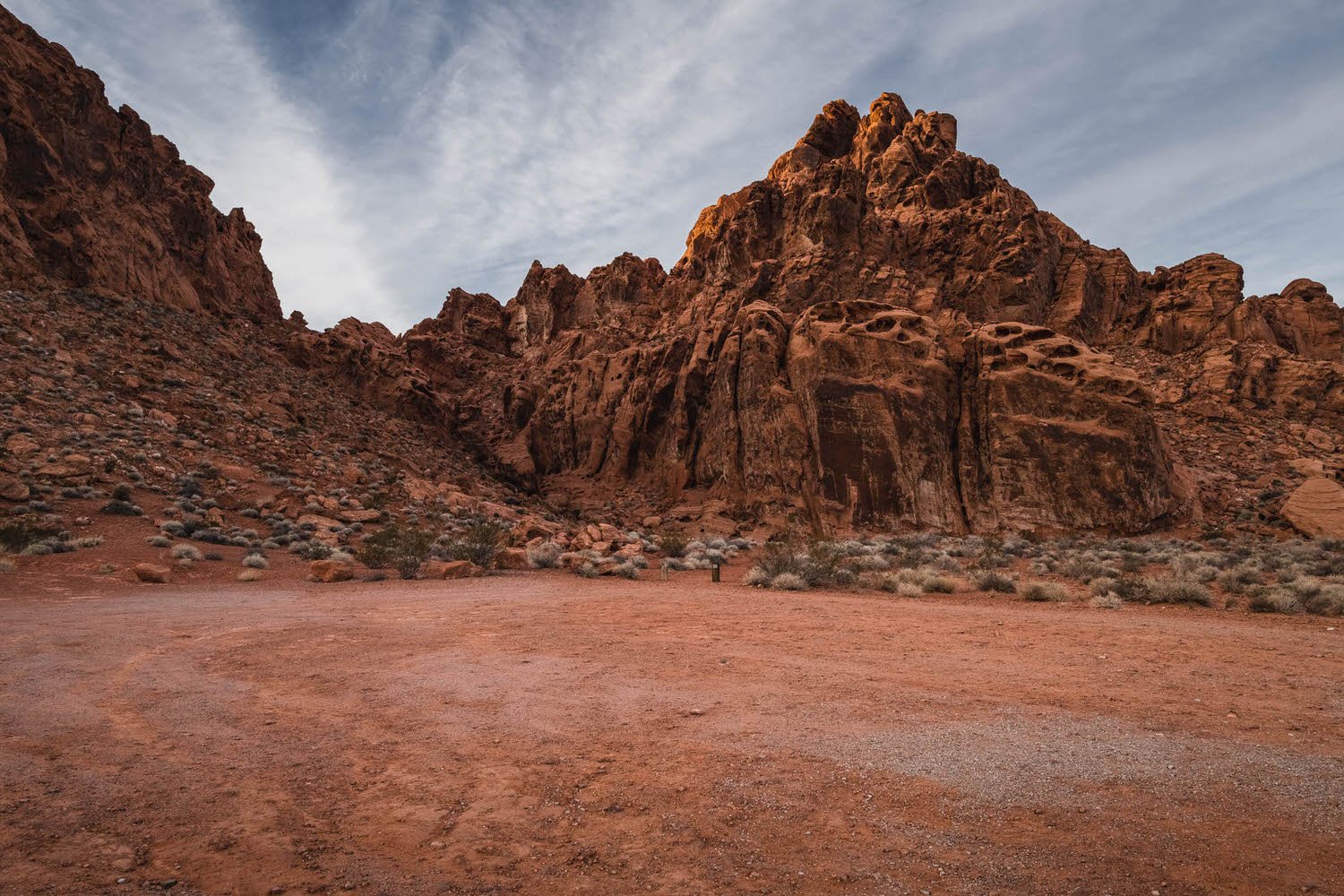
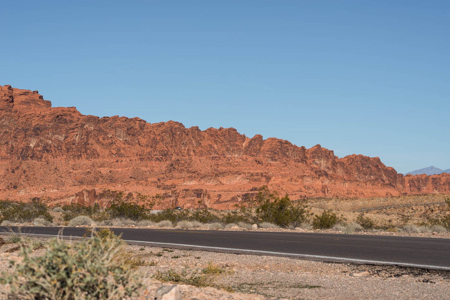
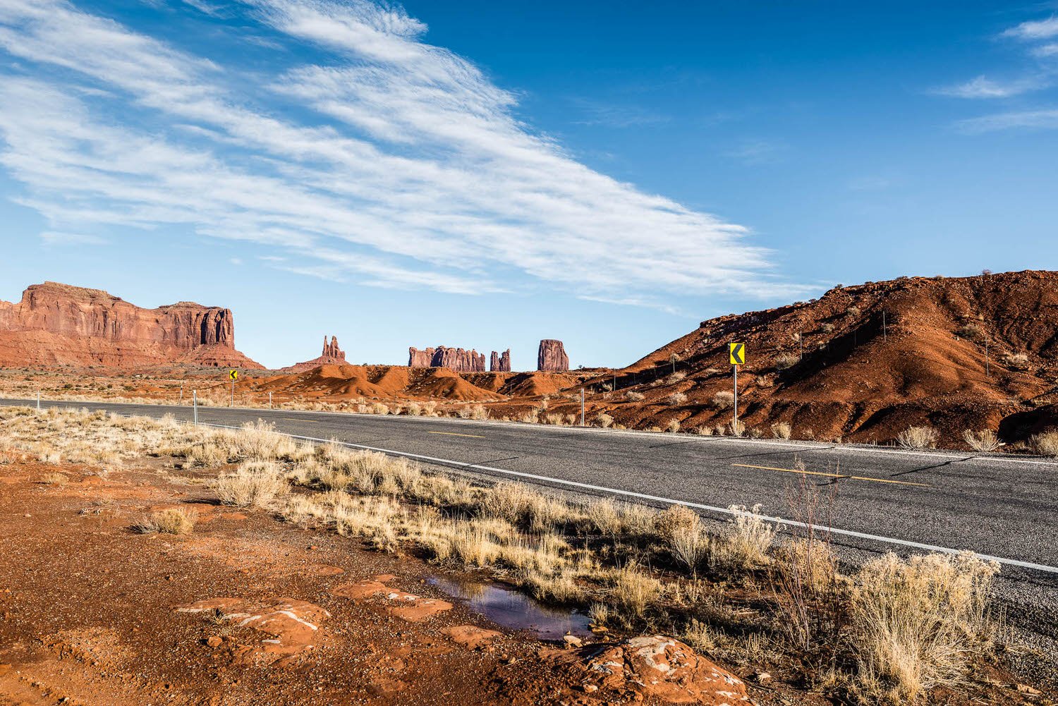
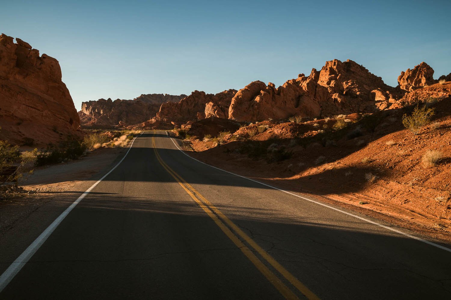
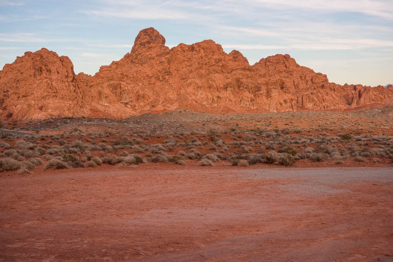
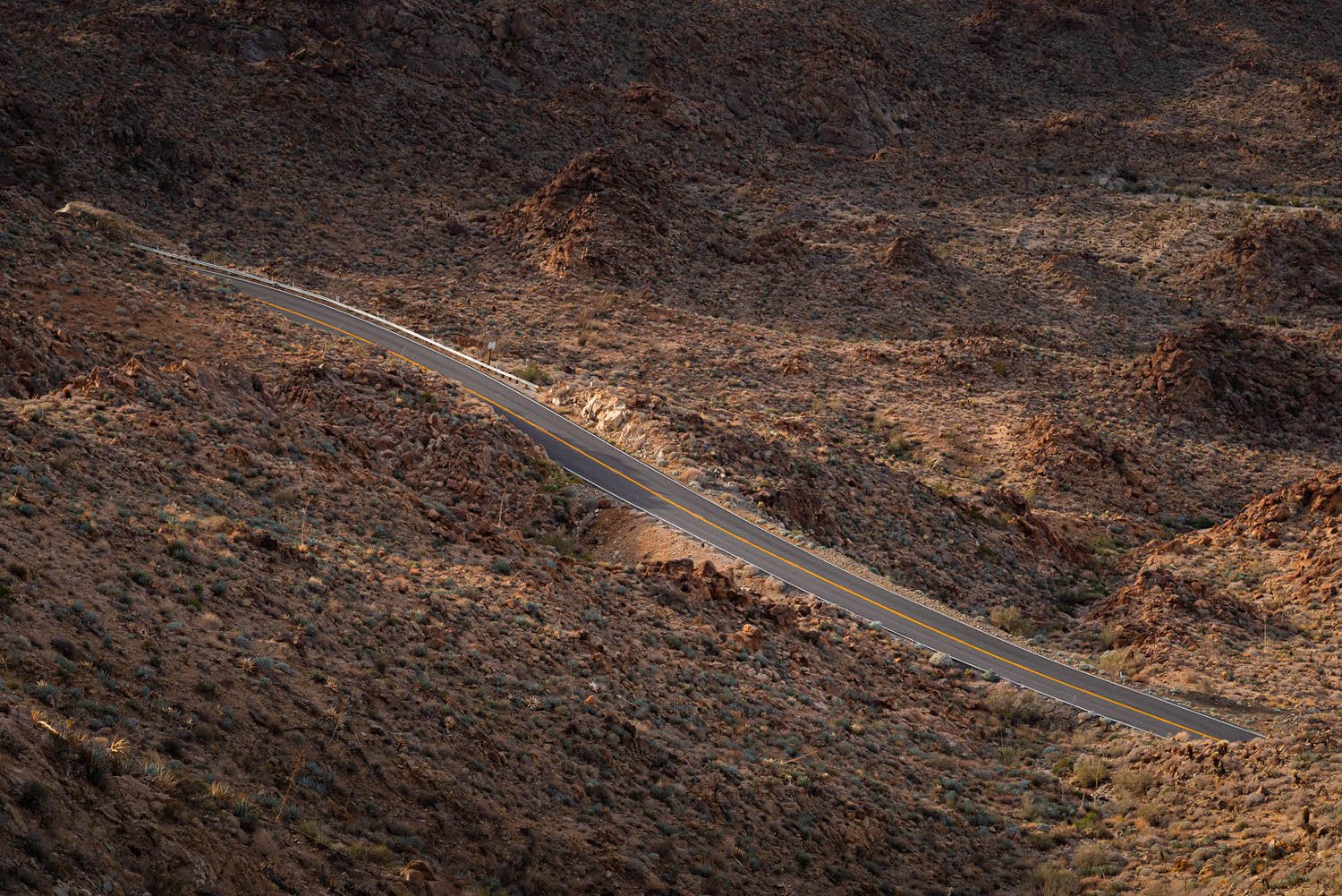
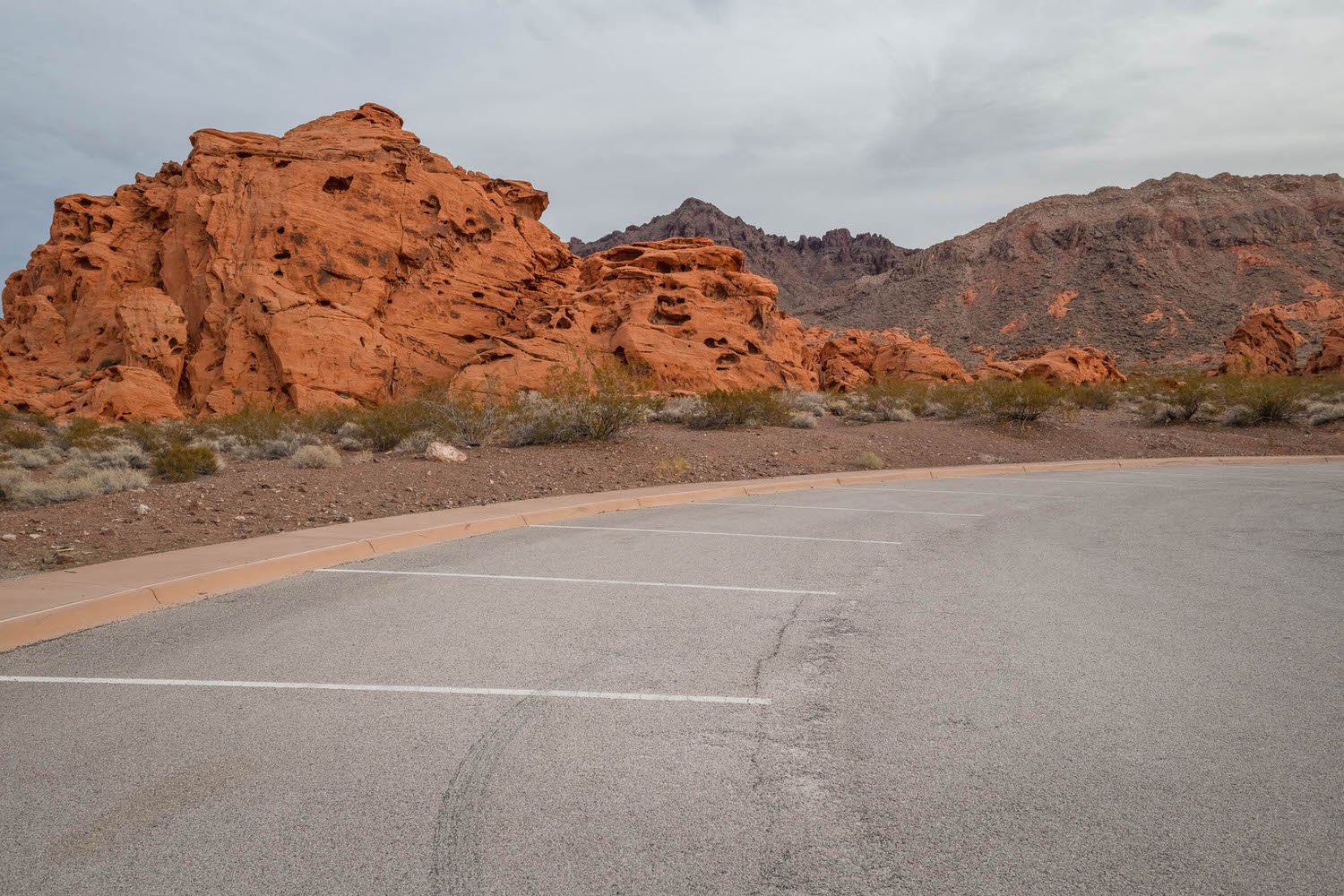
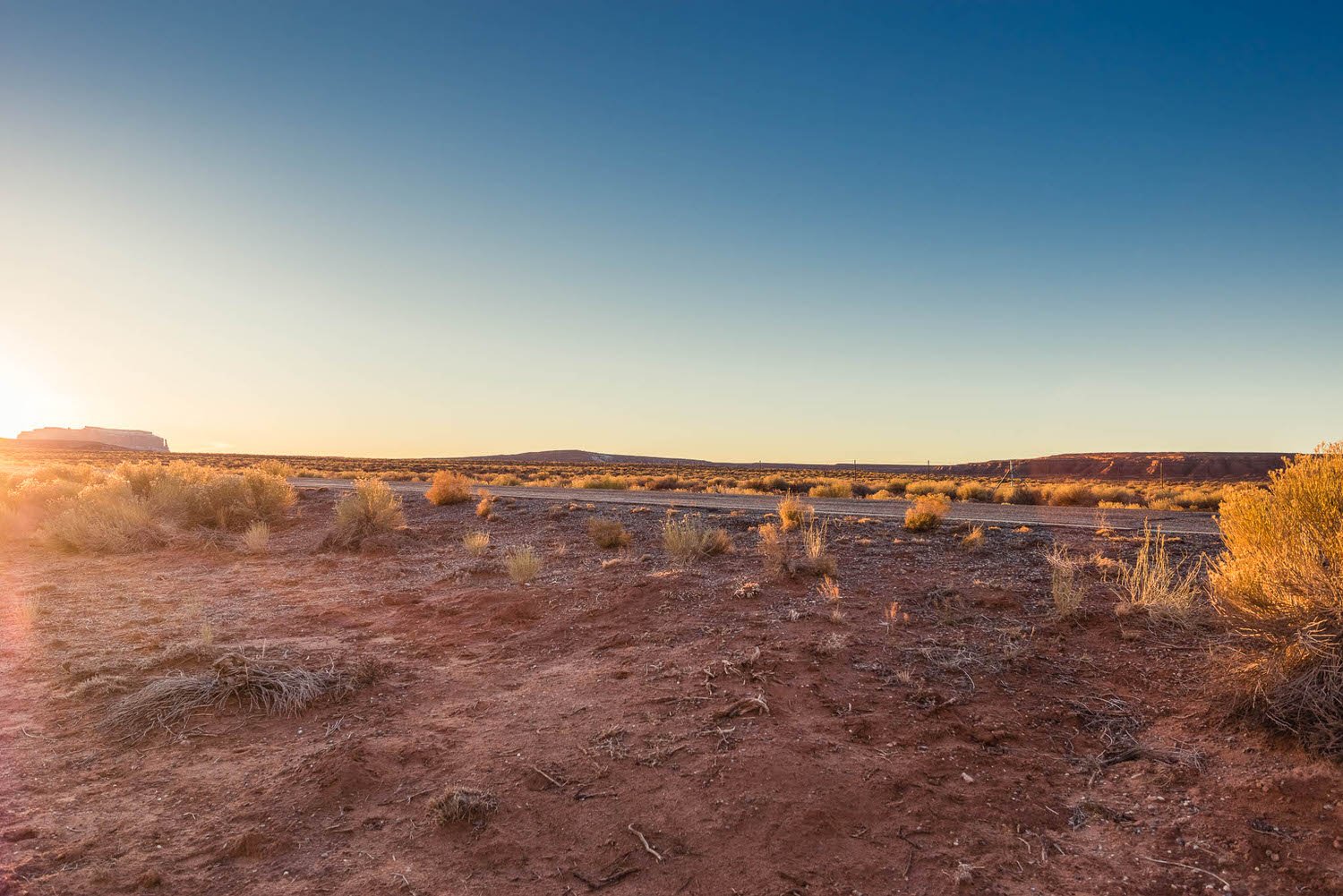
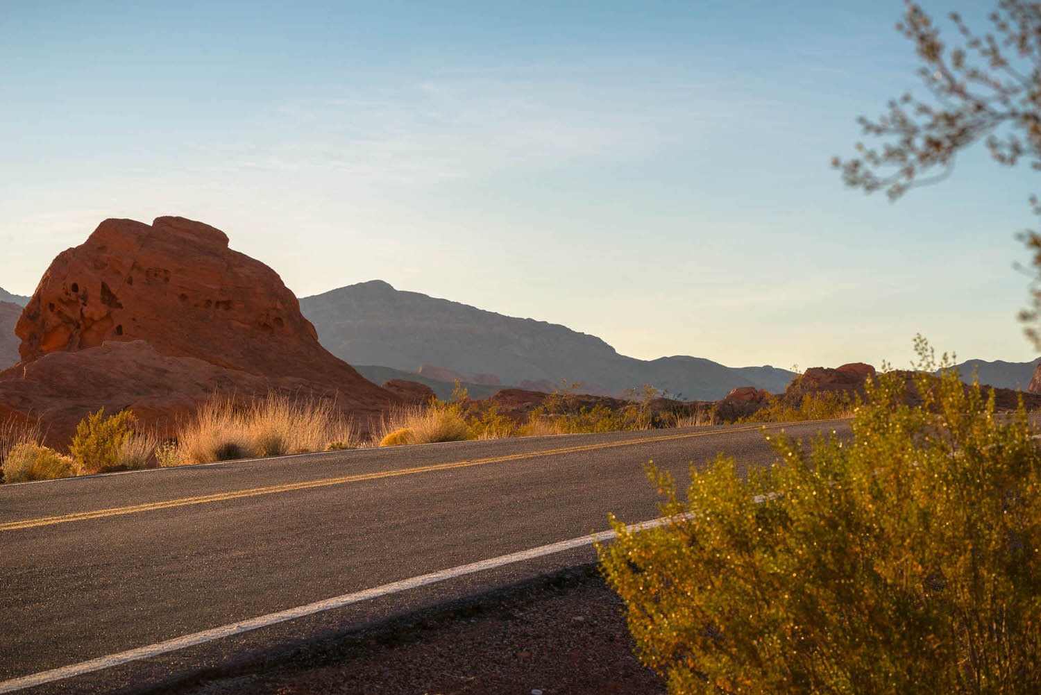
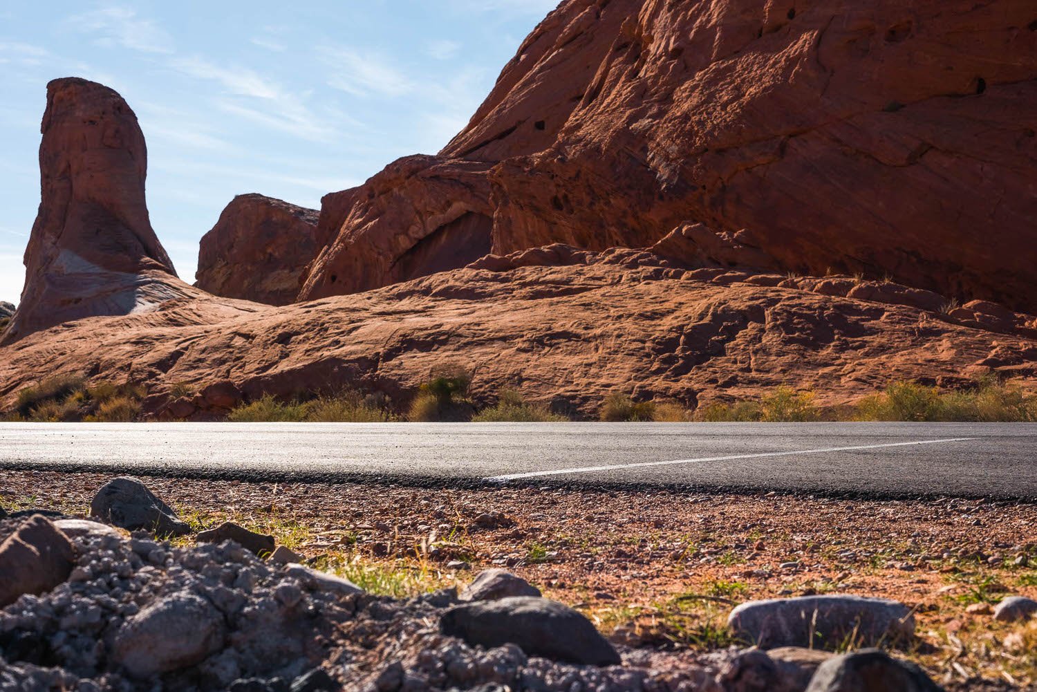
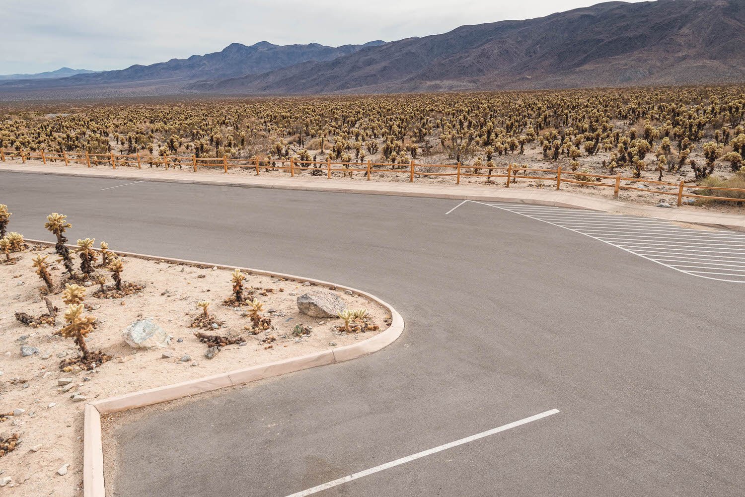
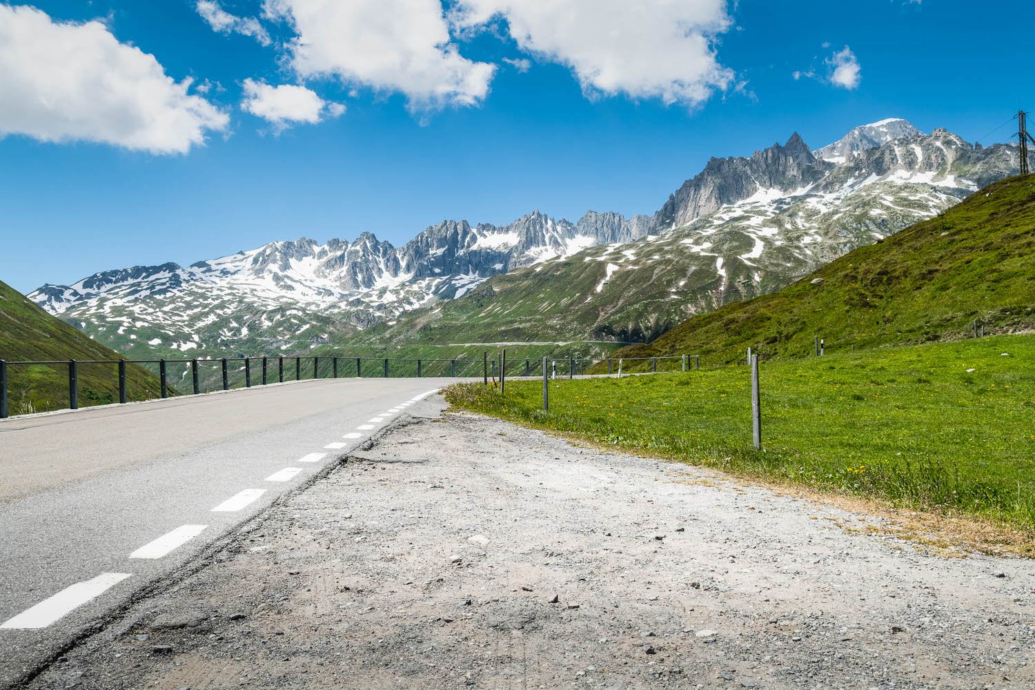
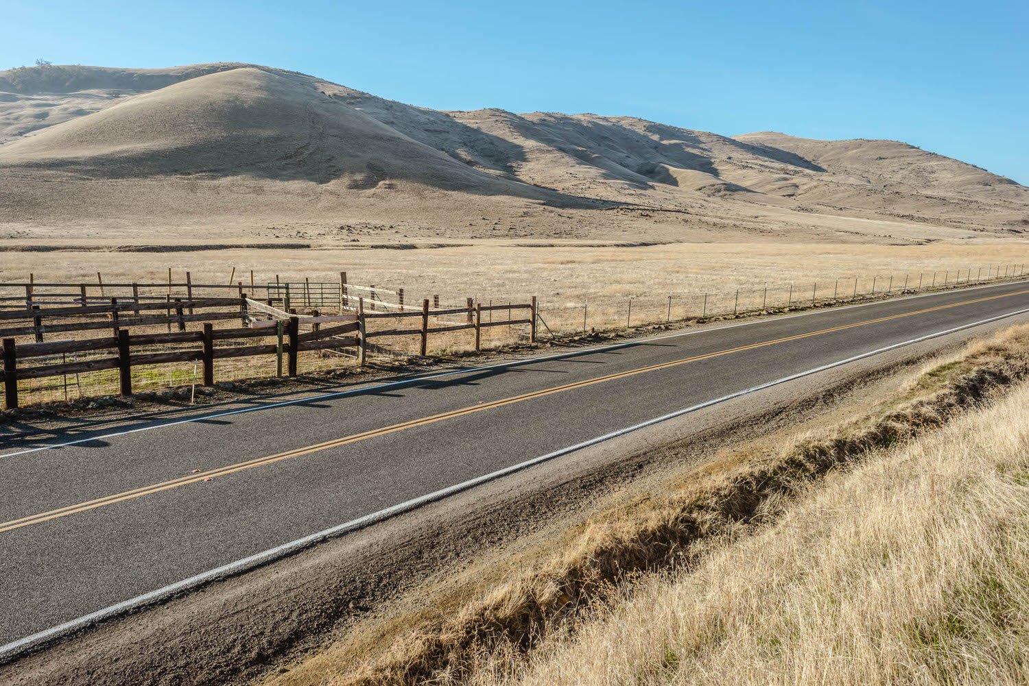
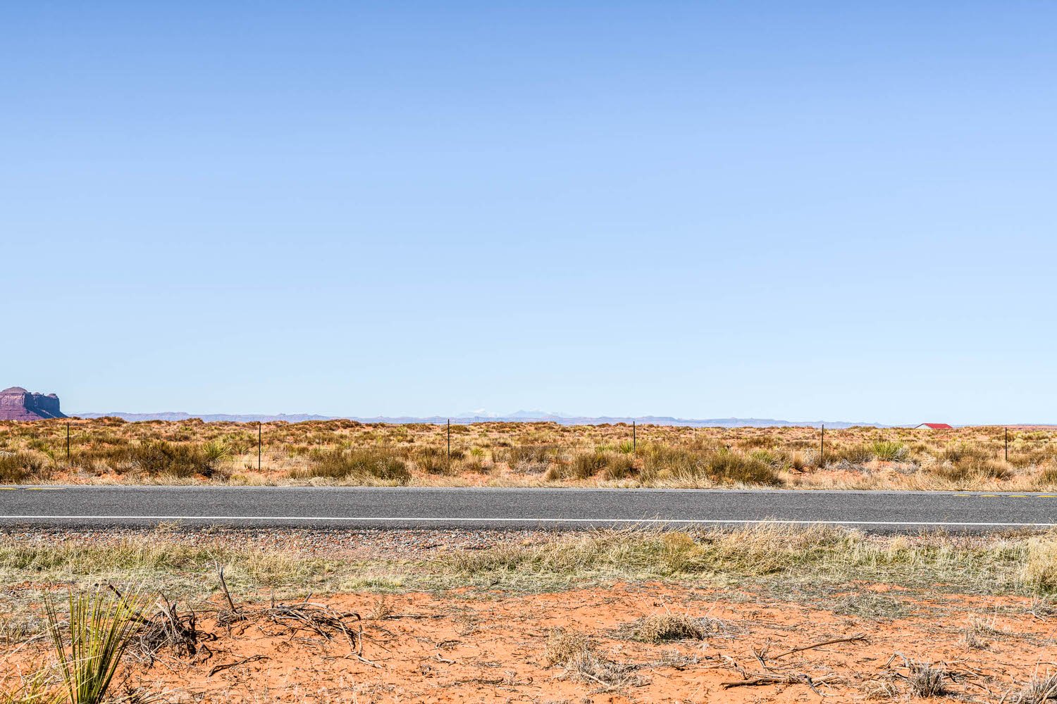
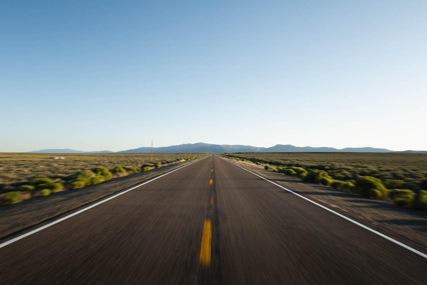
Red Rock Ride
The brief - Scenic drive through a fiery toned desert landscape

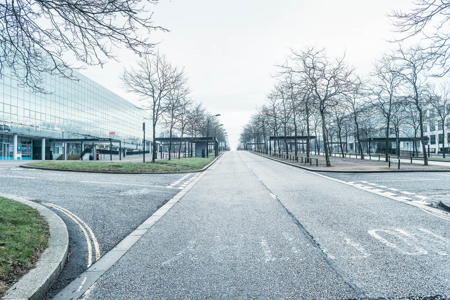
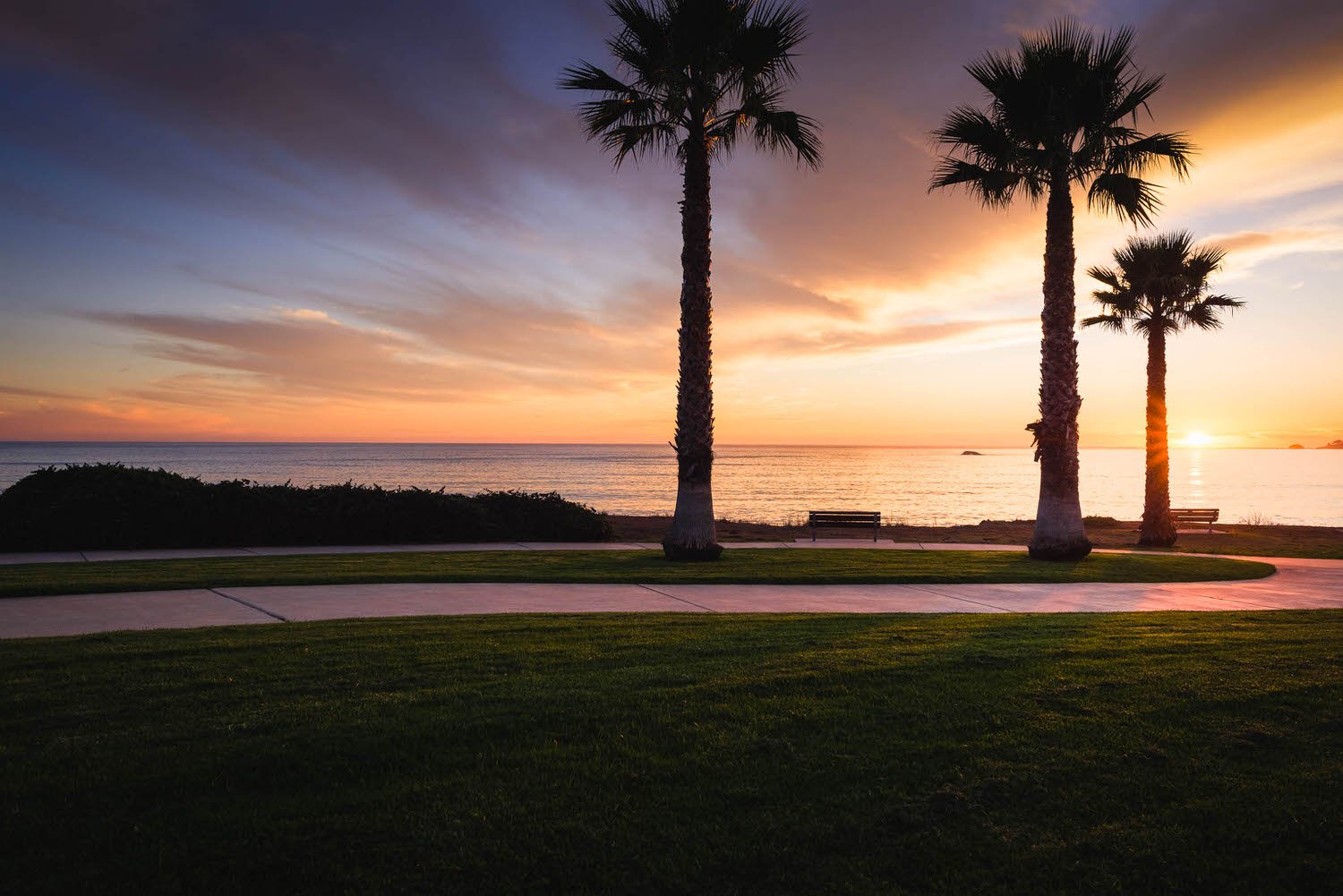
Just added
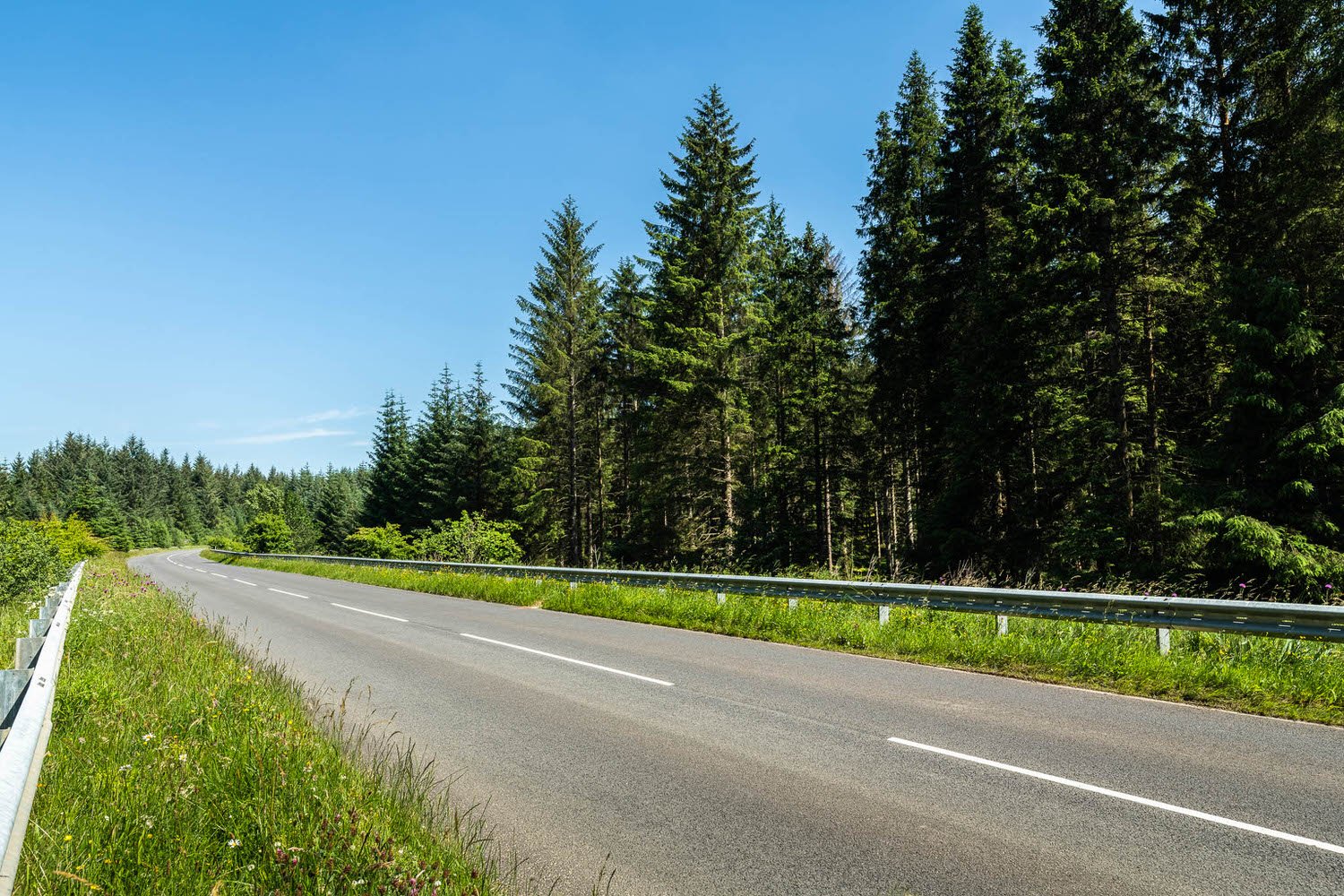
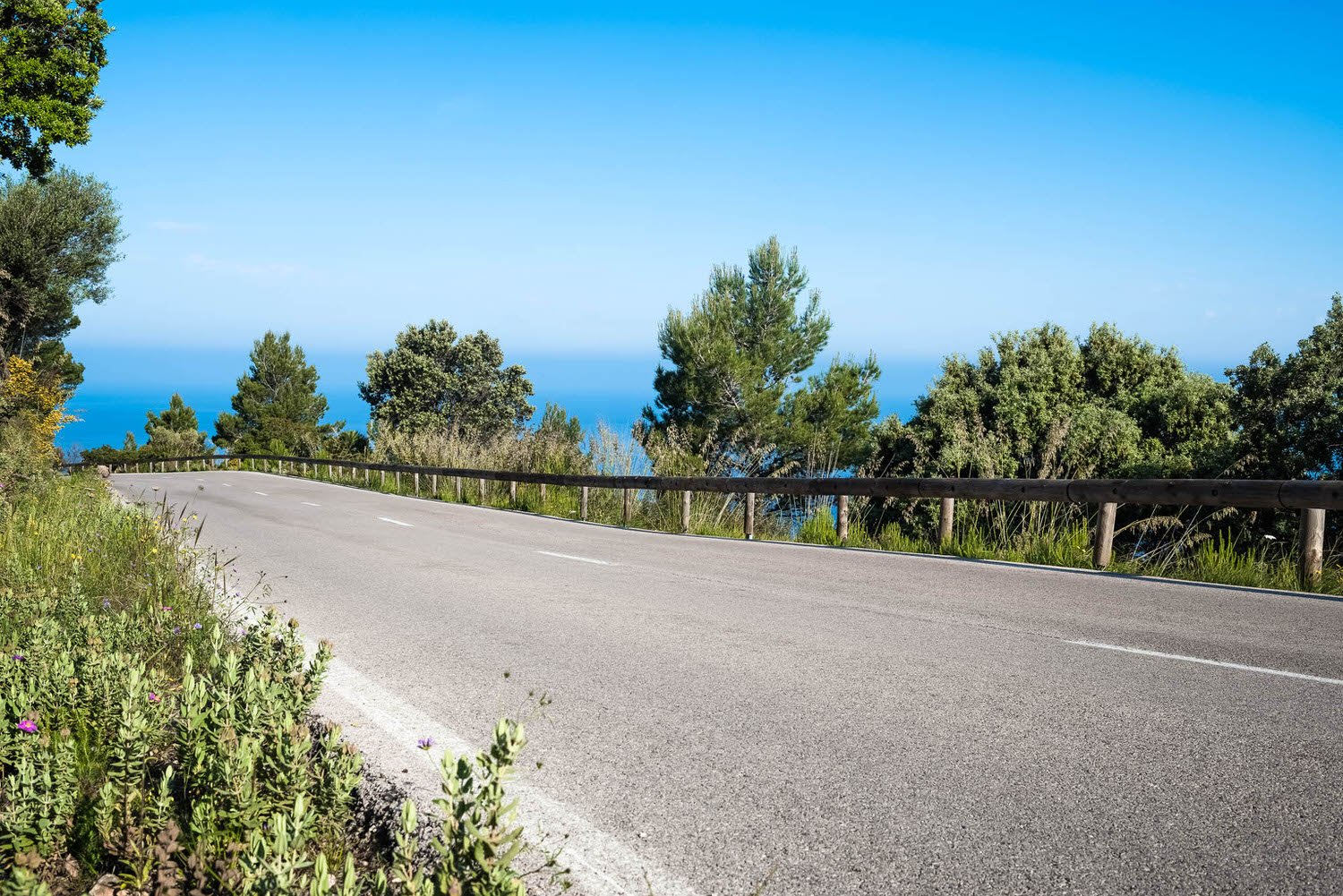
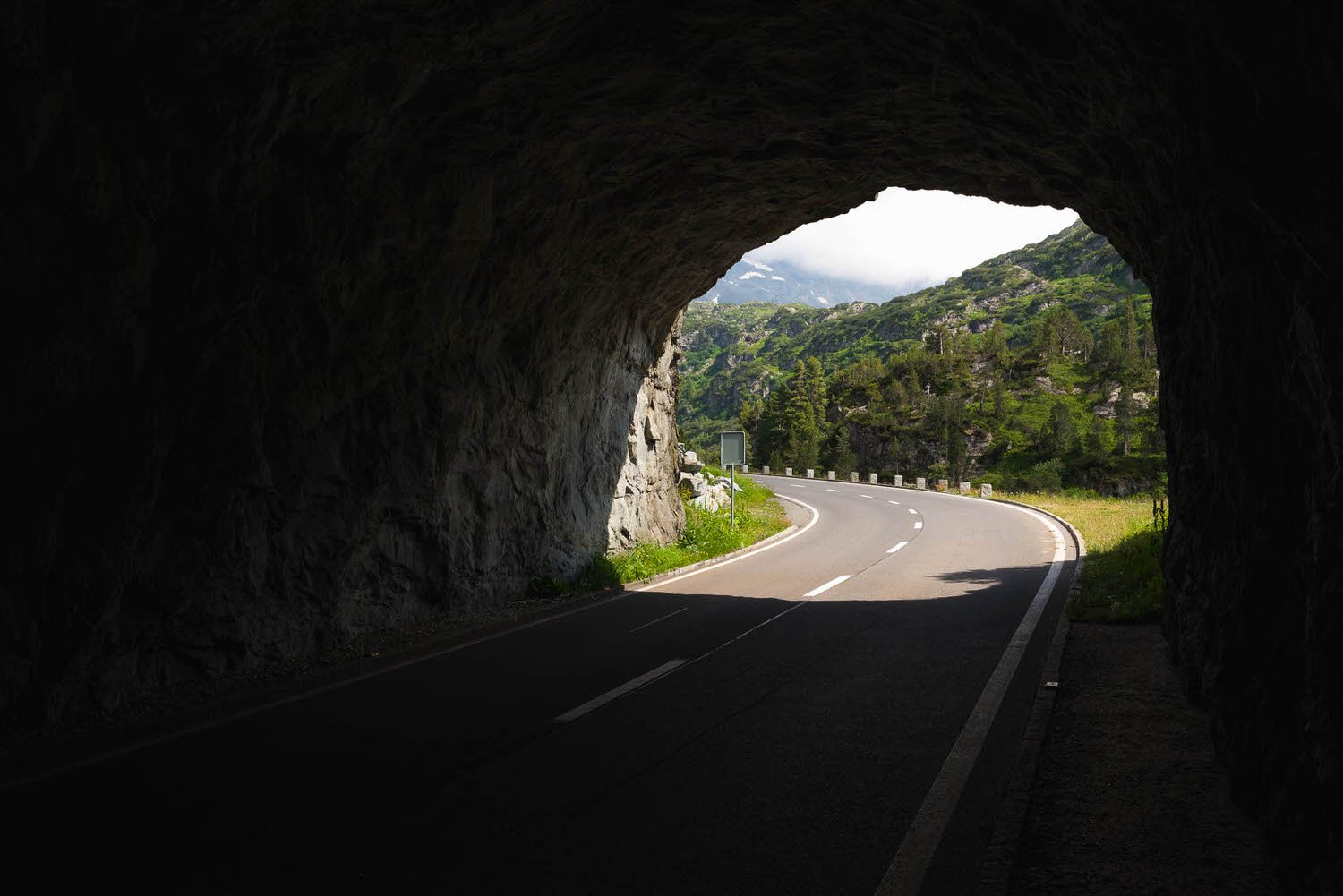
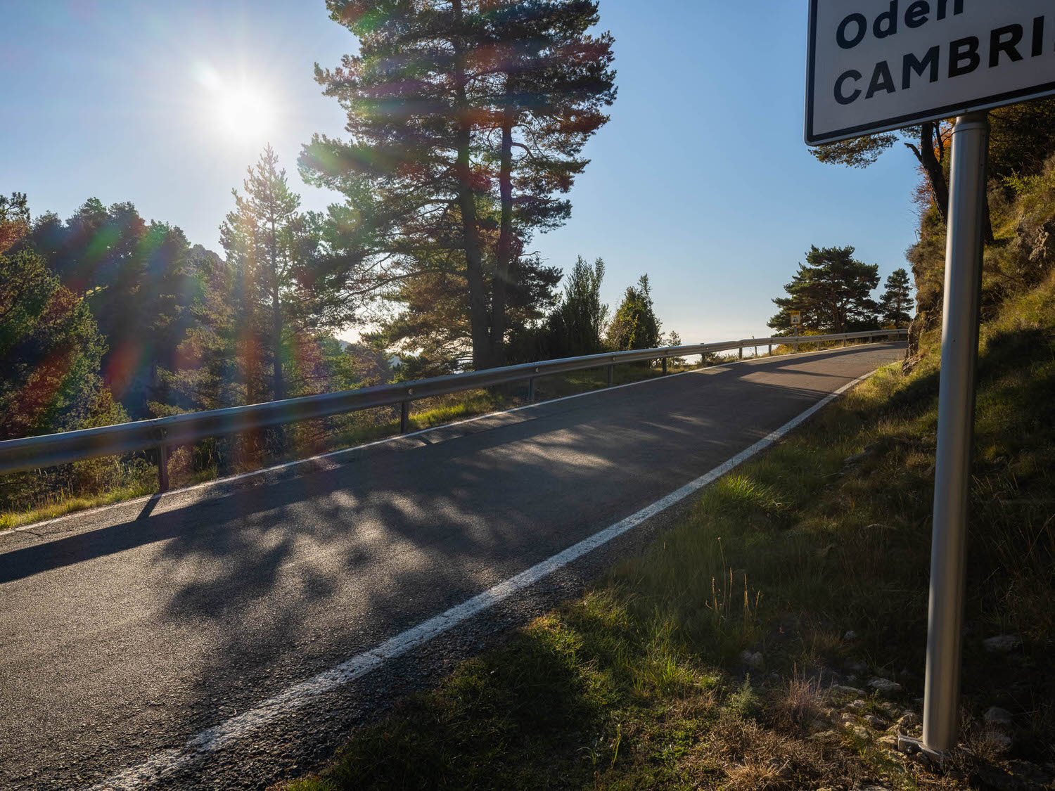
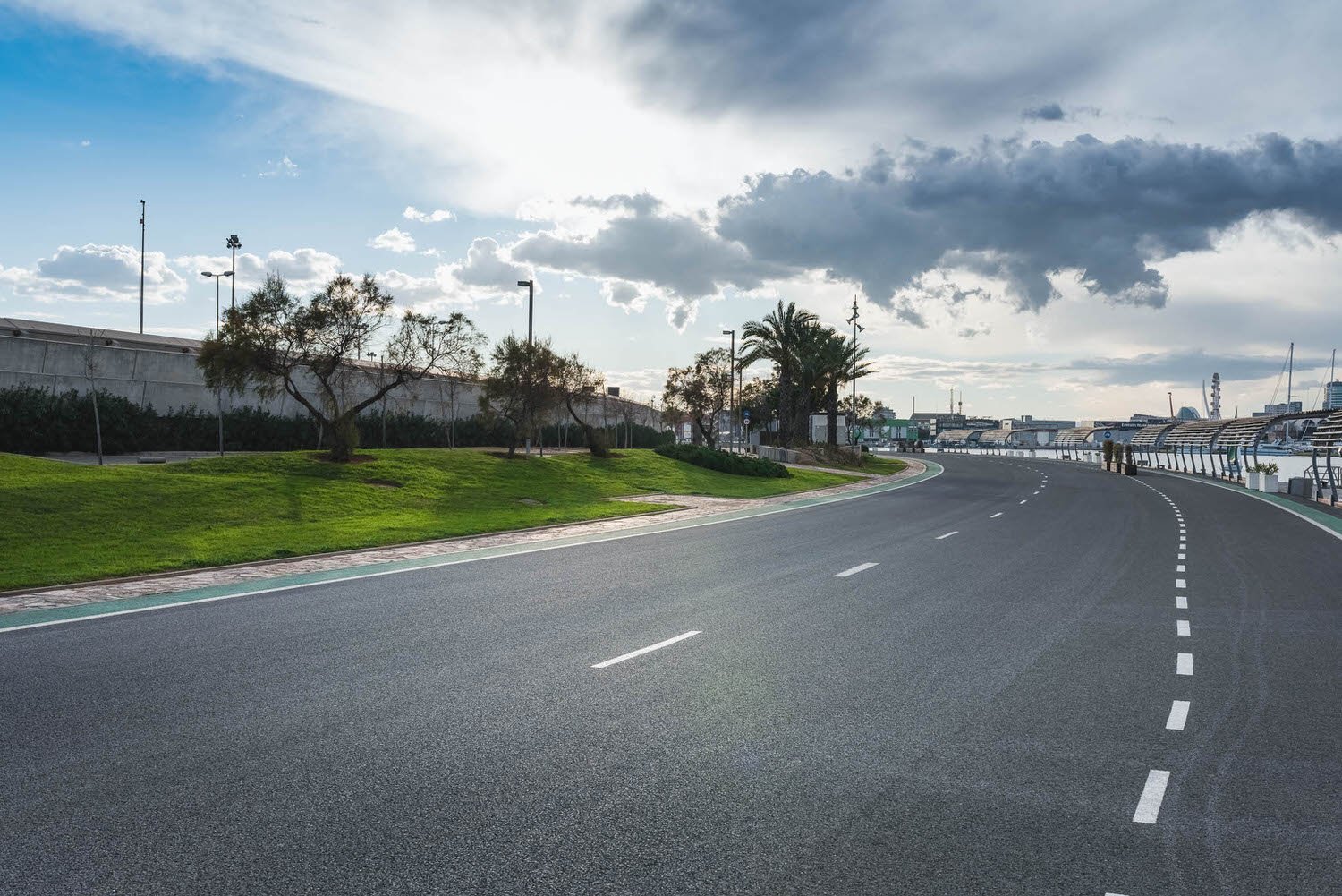
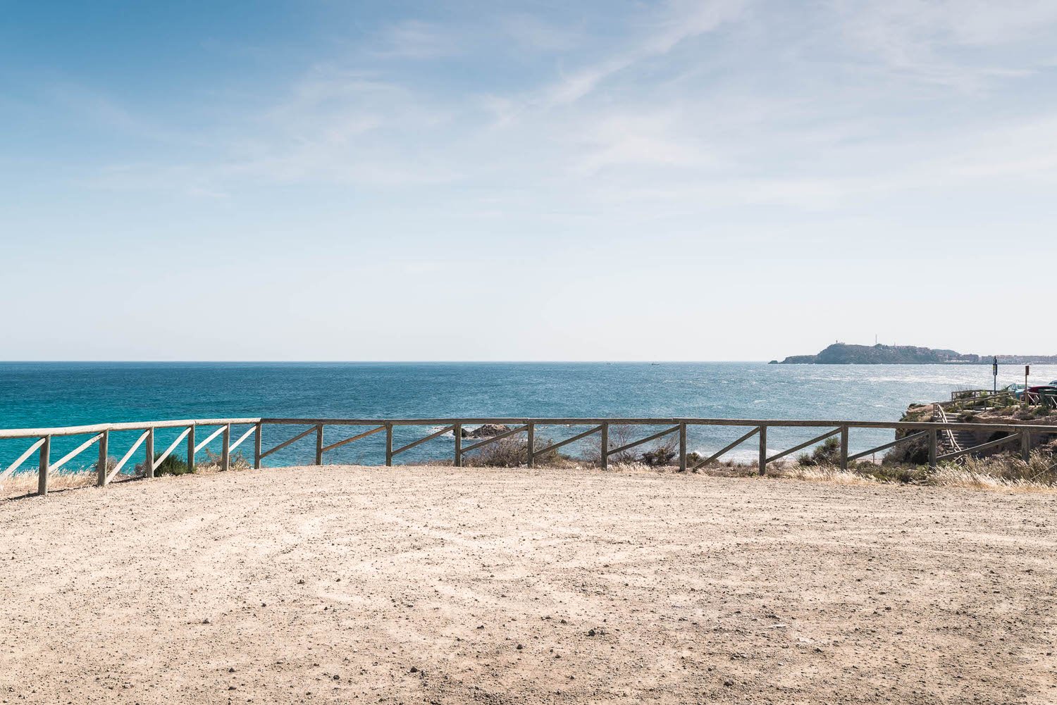
Coastal highway, scenic pullovers & European city.


This month’s editors choice has been hand picked by Matthew
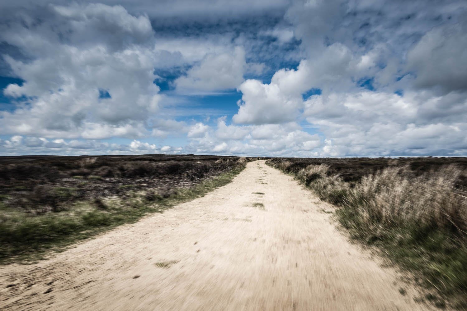
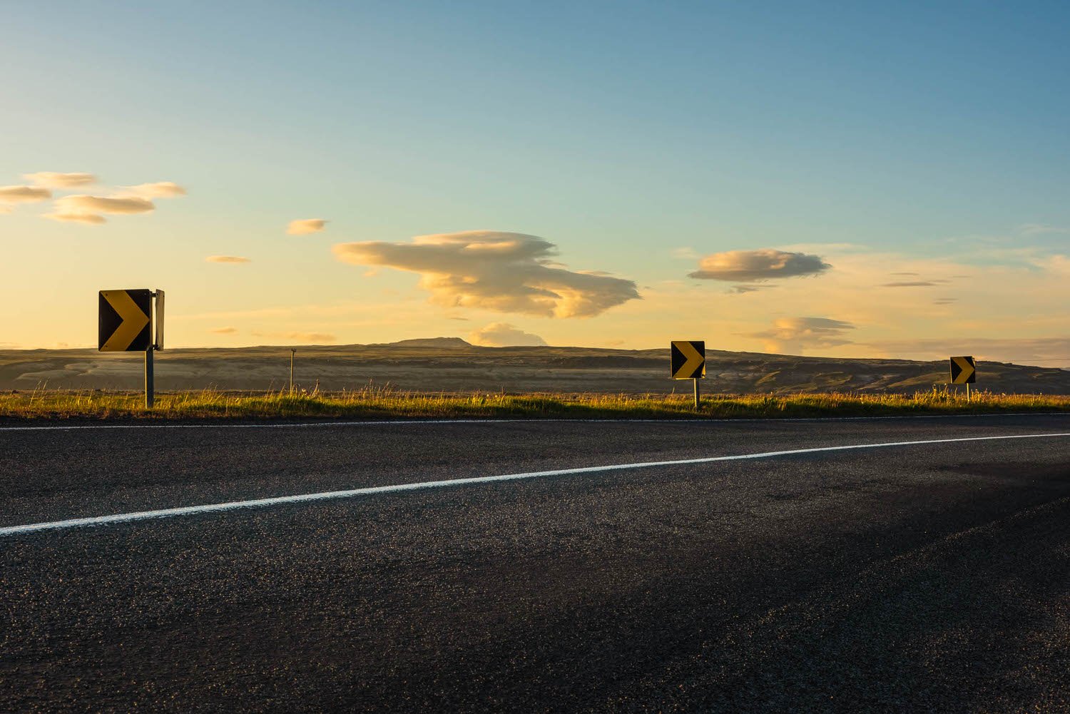
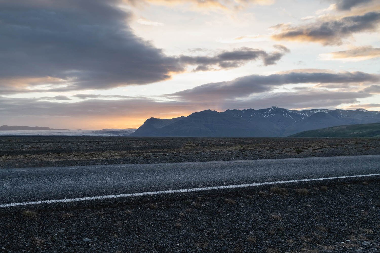
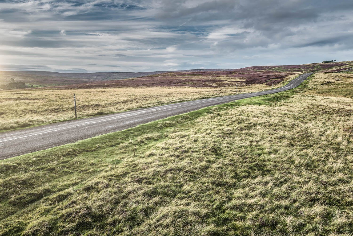
Cloud Appreciation
When I was a child I used to spend hours watching the clouds, laying on my back in the grass in the garden or on a warm sunny beach or admiring storms from behind a window. I never tired of the ever changing shapes and patterns they created on the sky’s vast canvas. They all deserve appreciation but my personal favourite will always be the humble Cirrus!
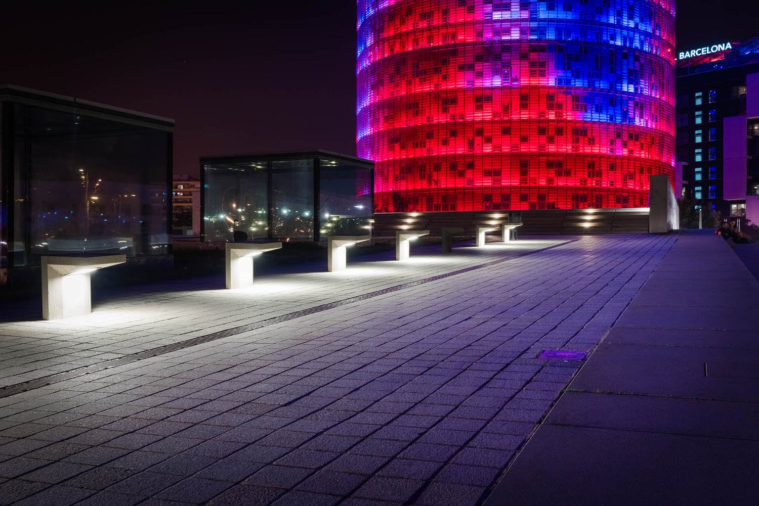
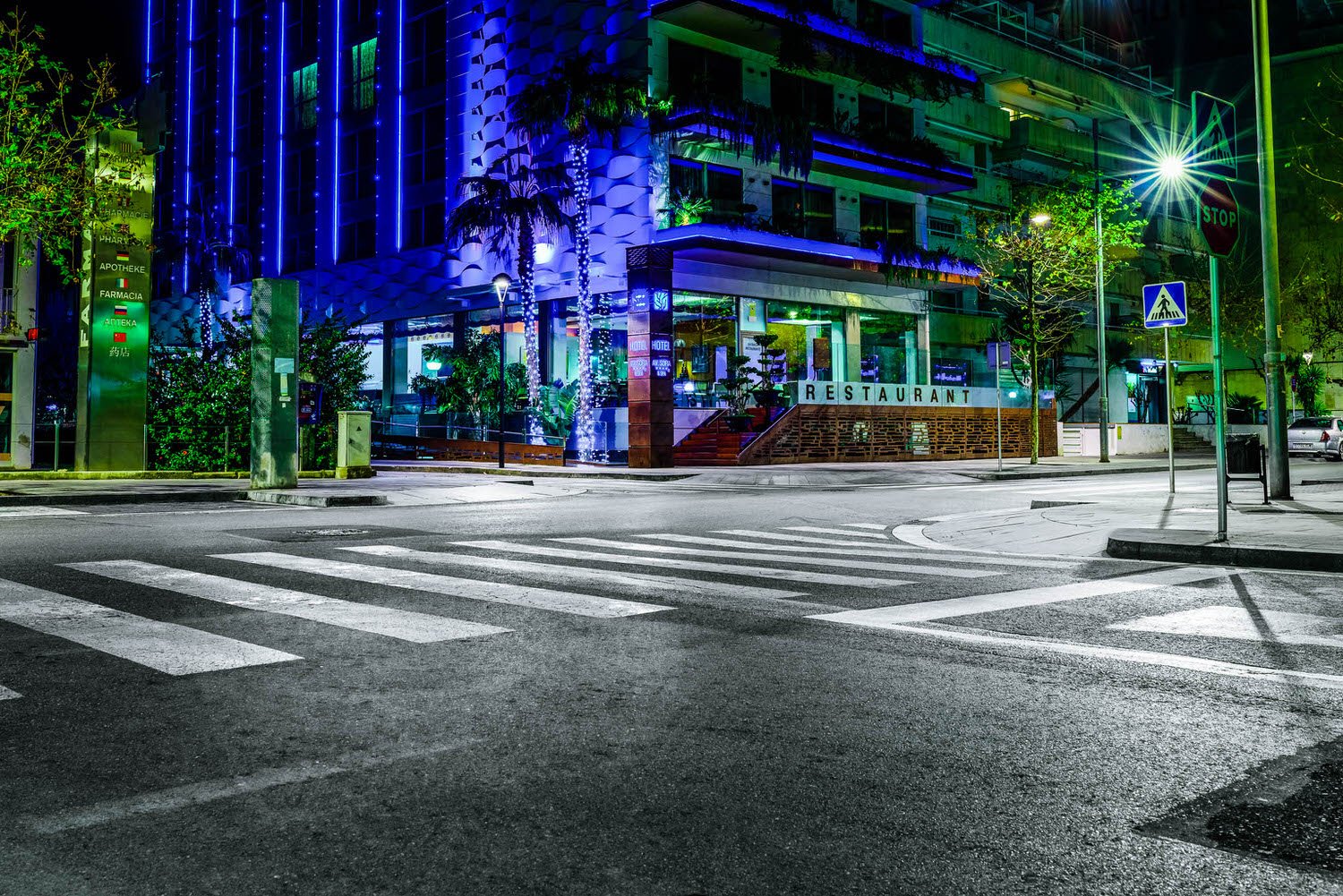
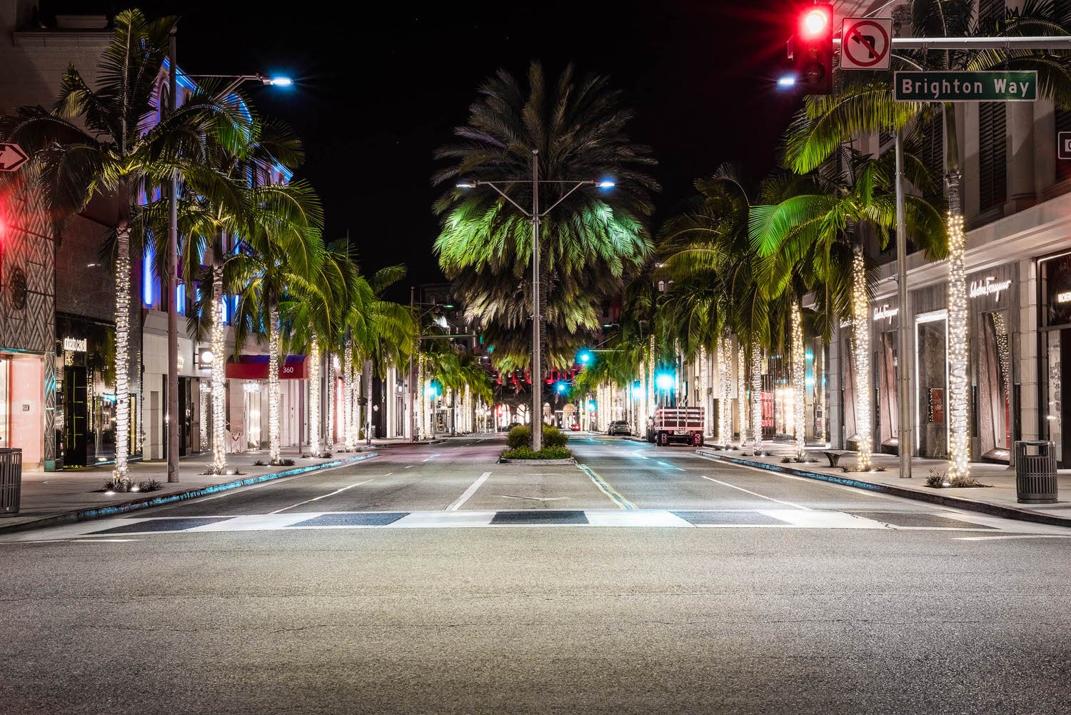
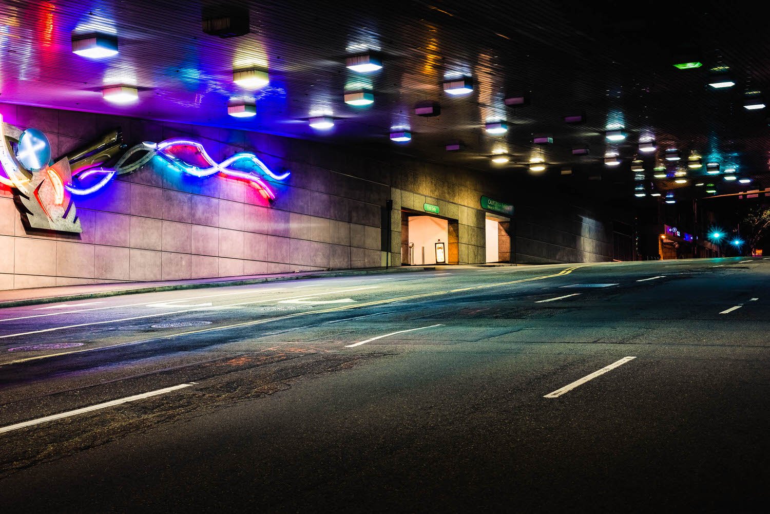
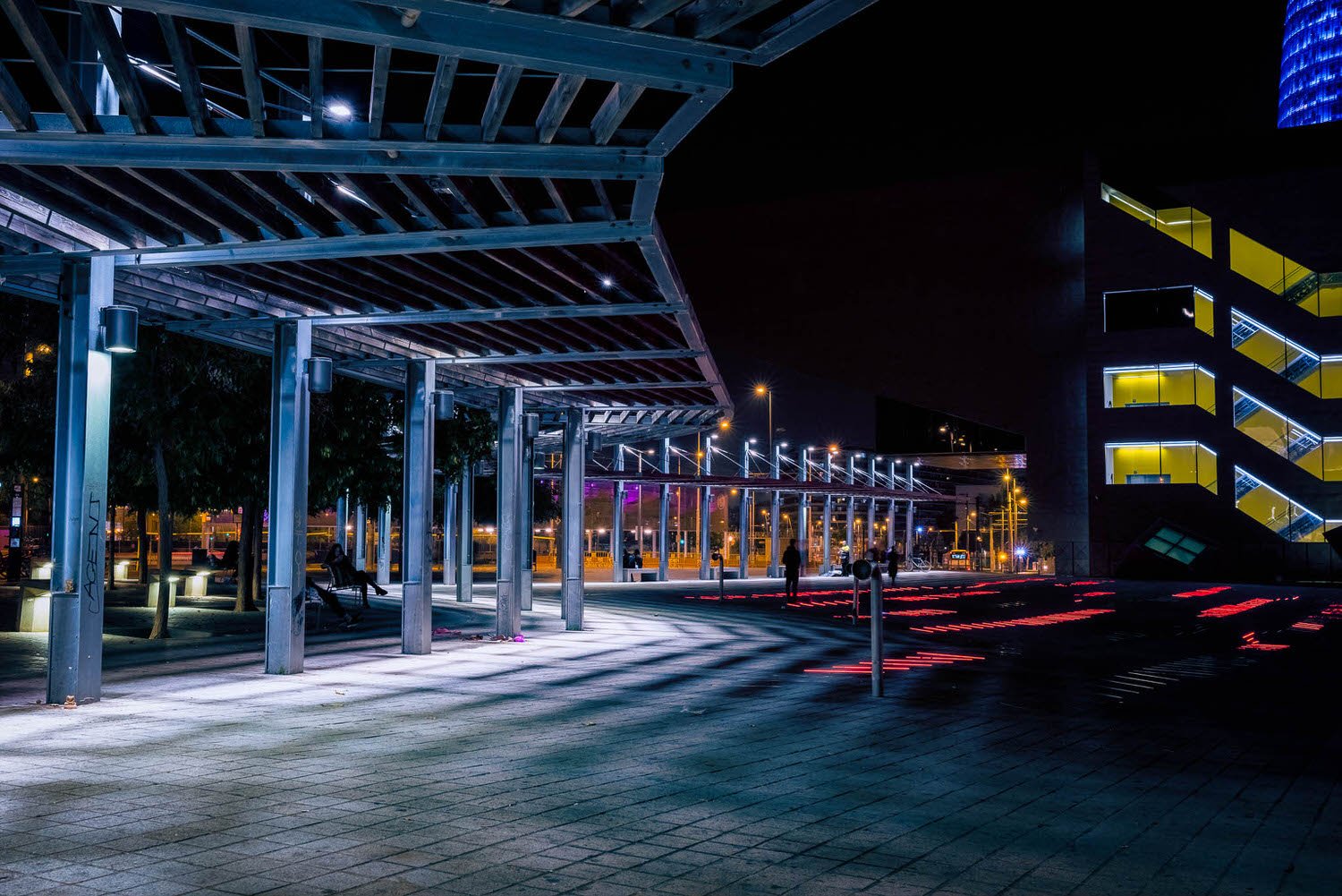
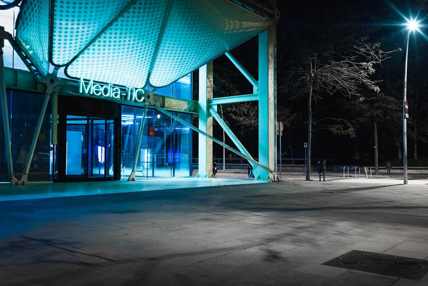
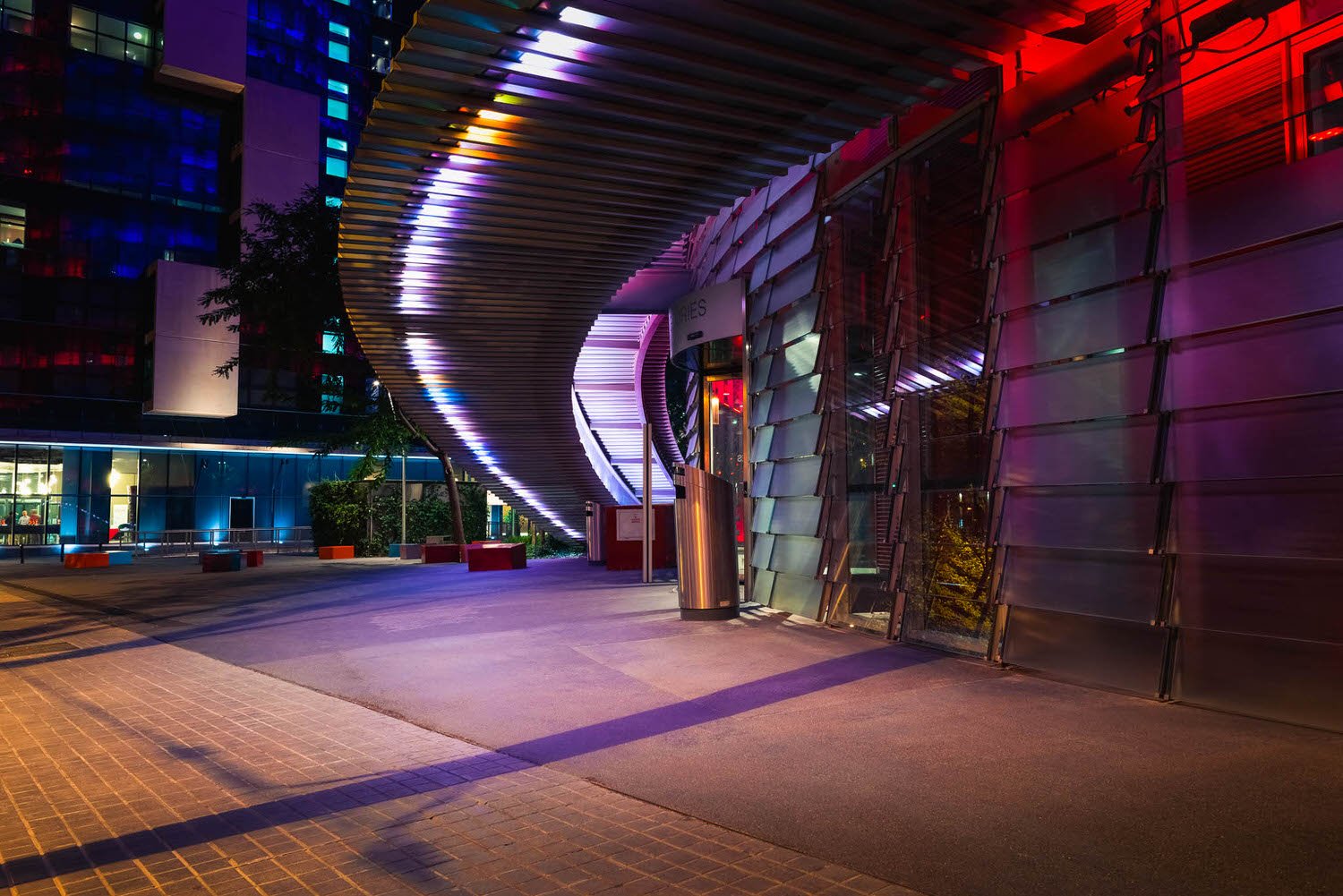
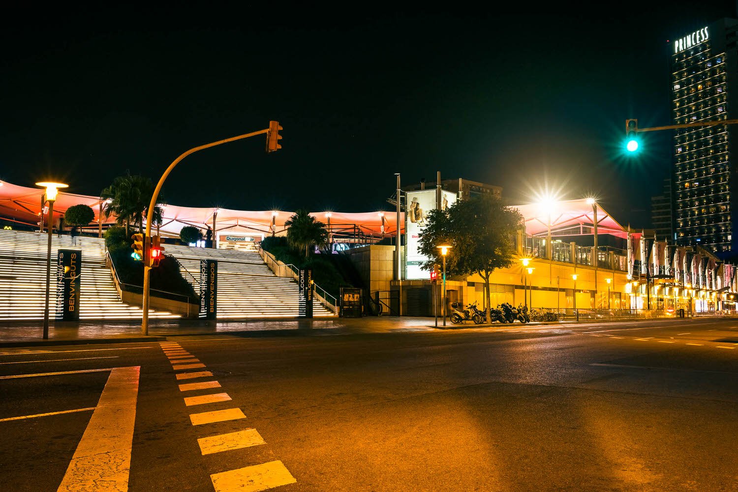
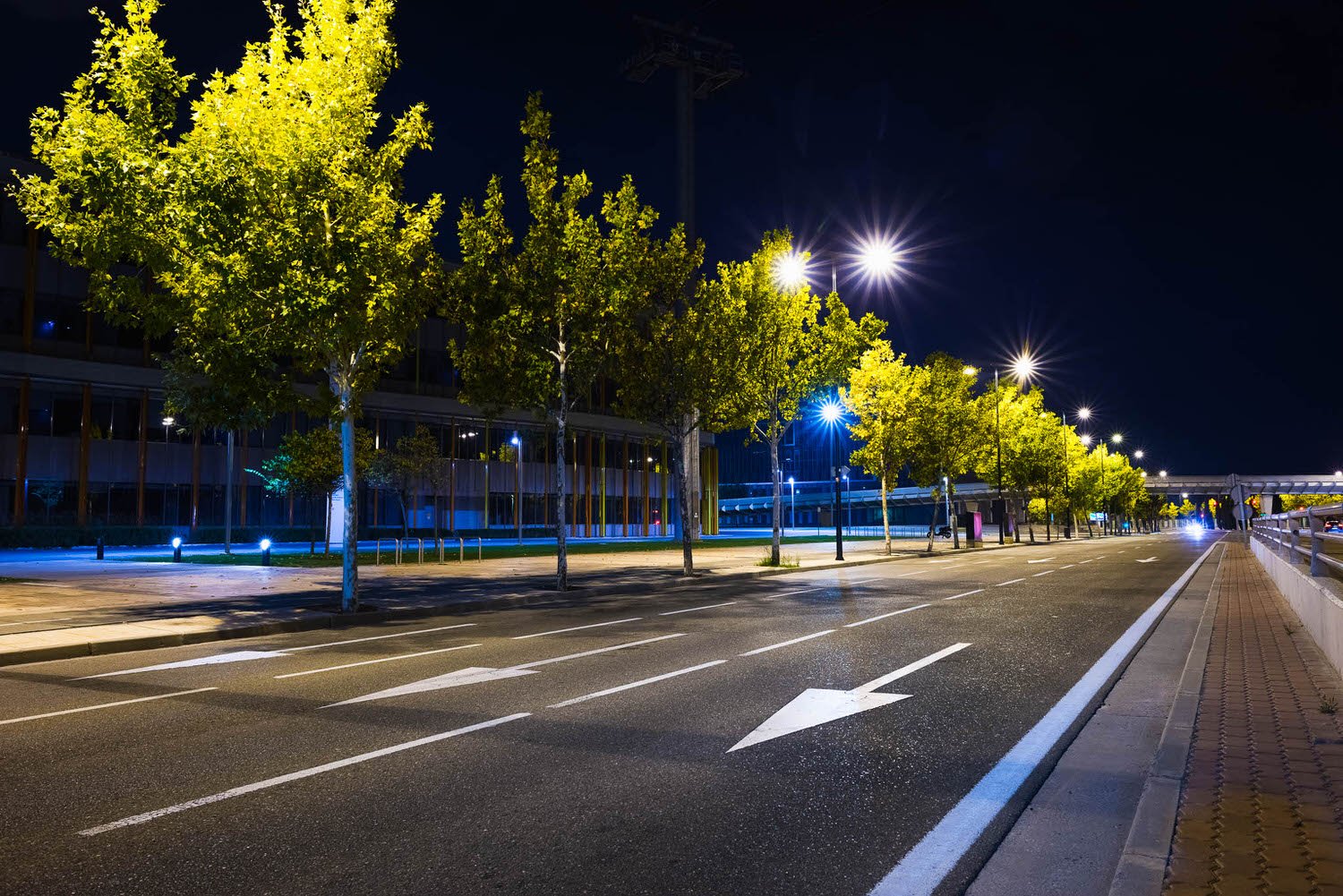
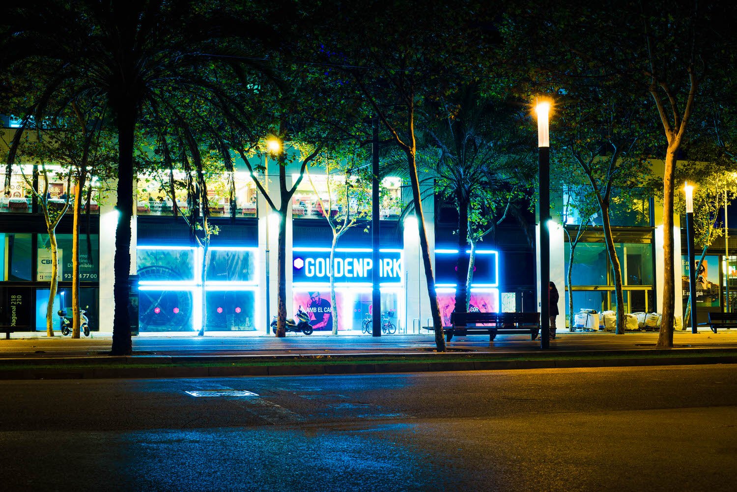
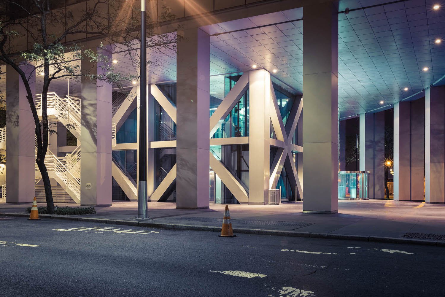
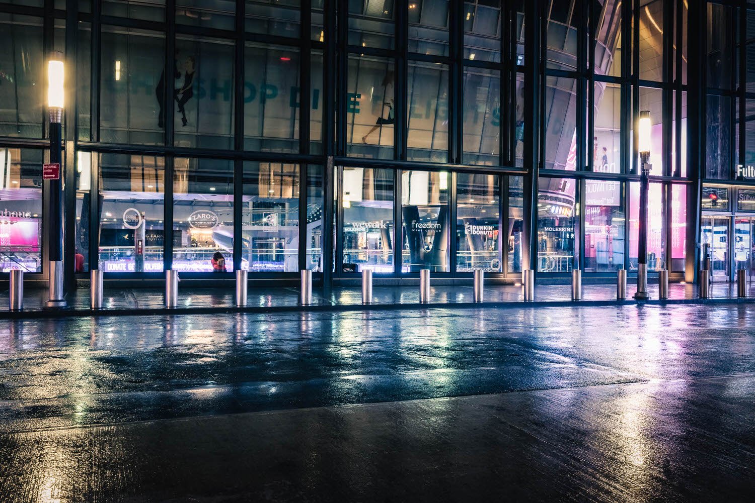
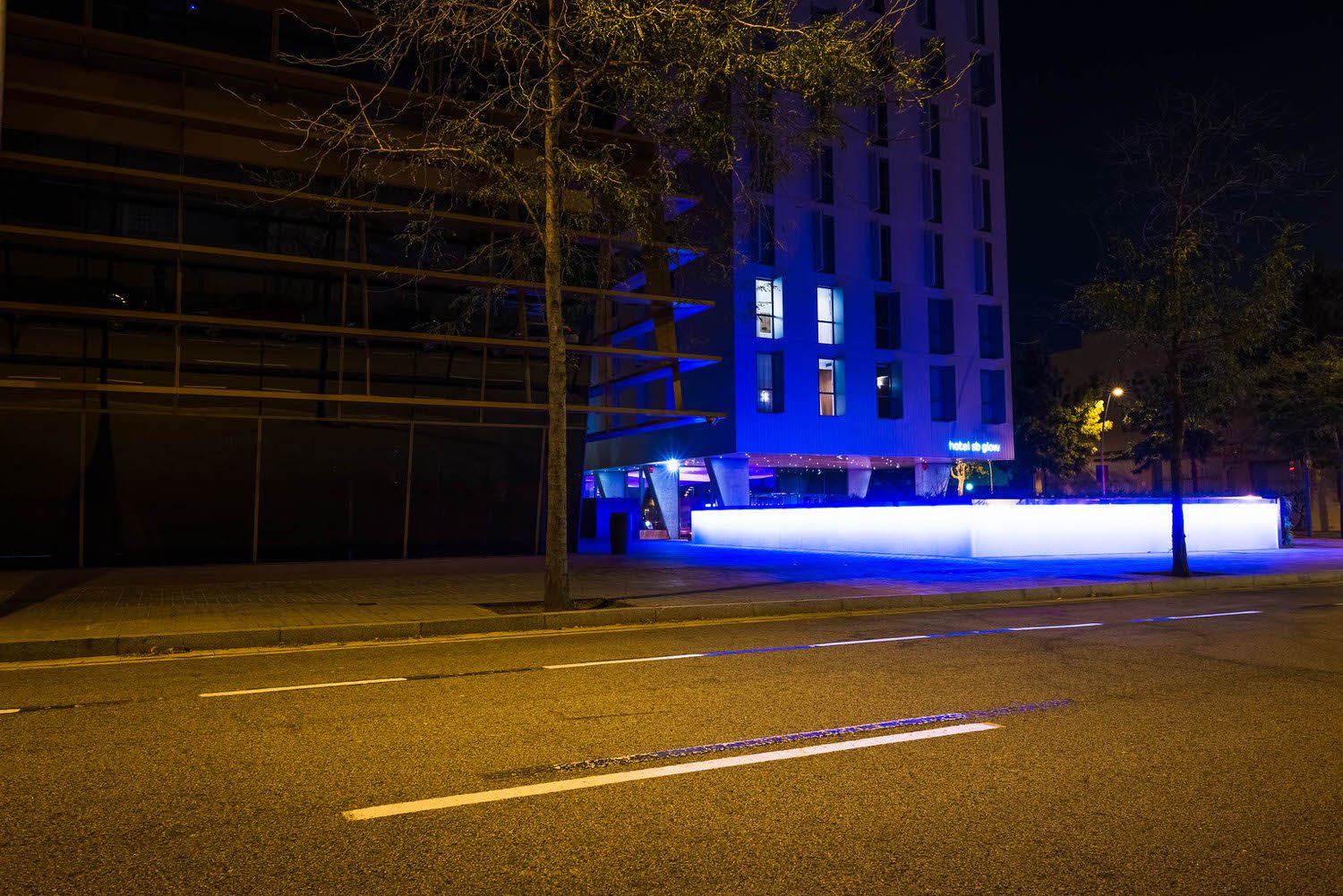
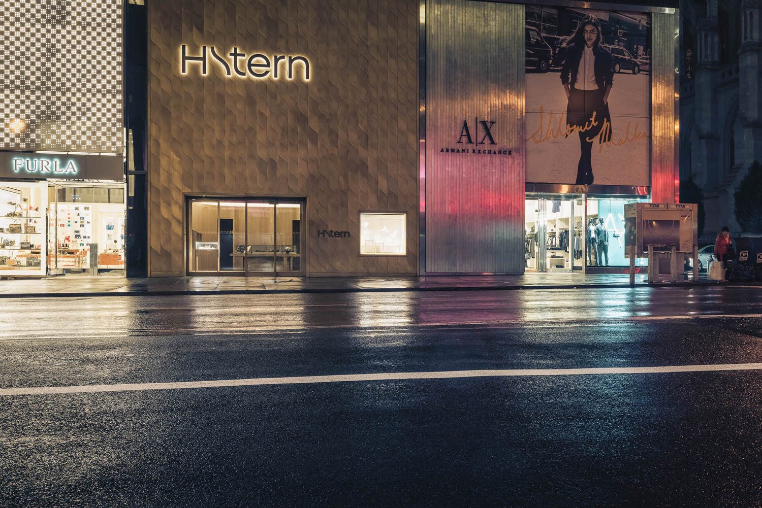
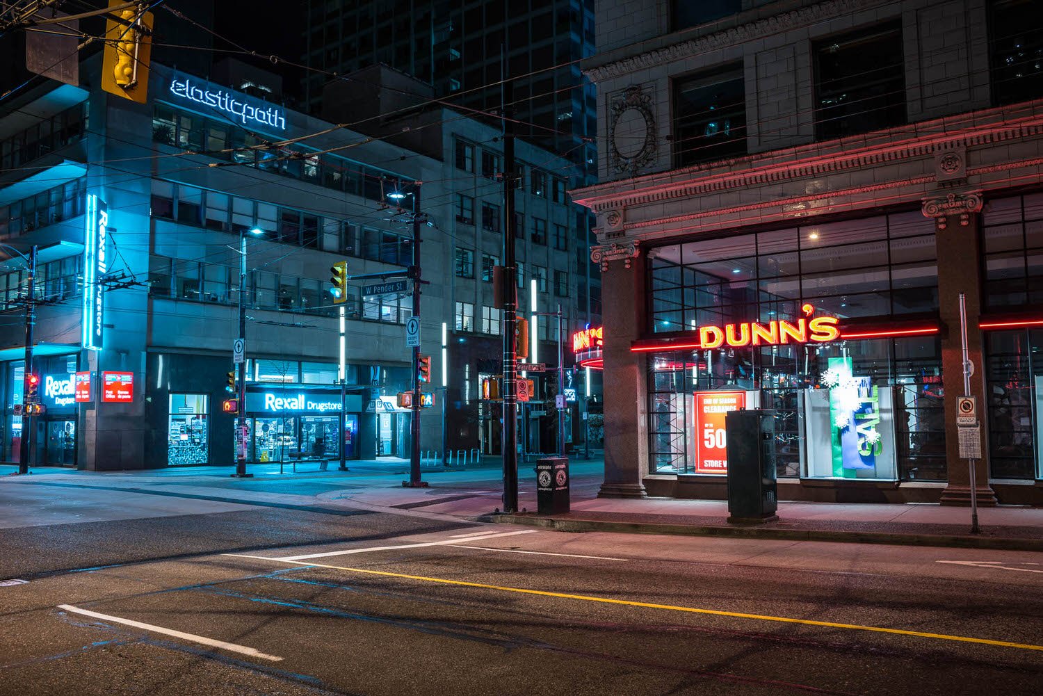
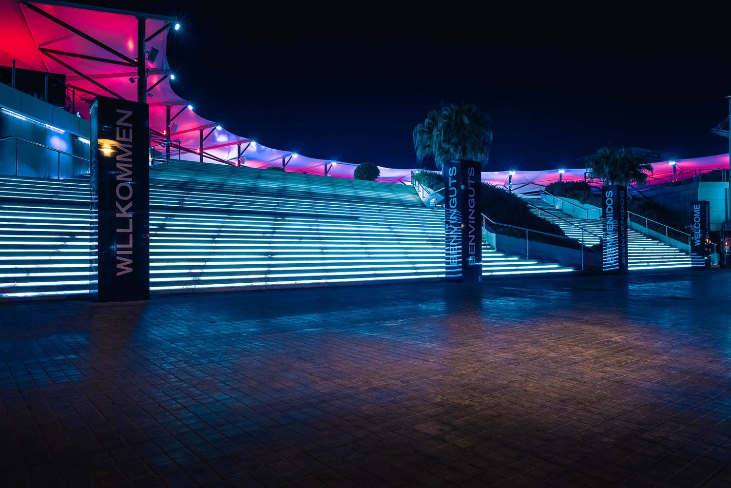
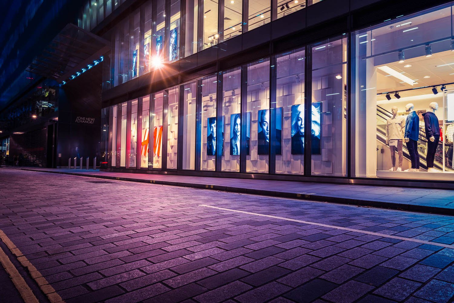
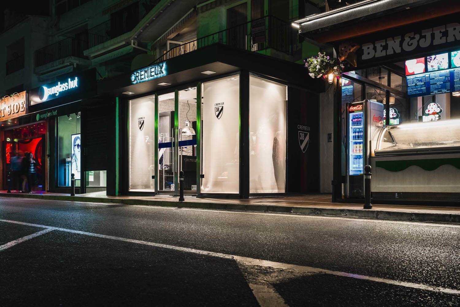
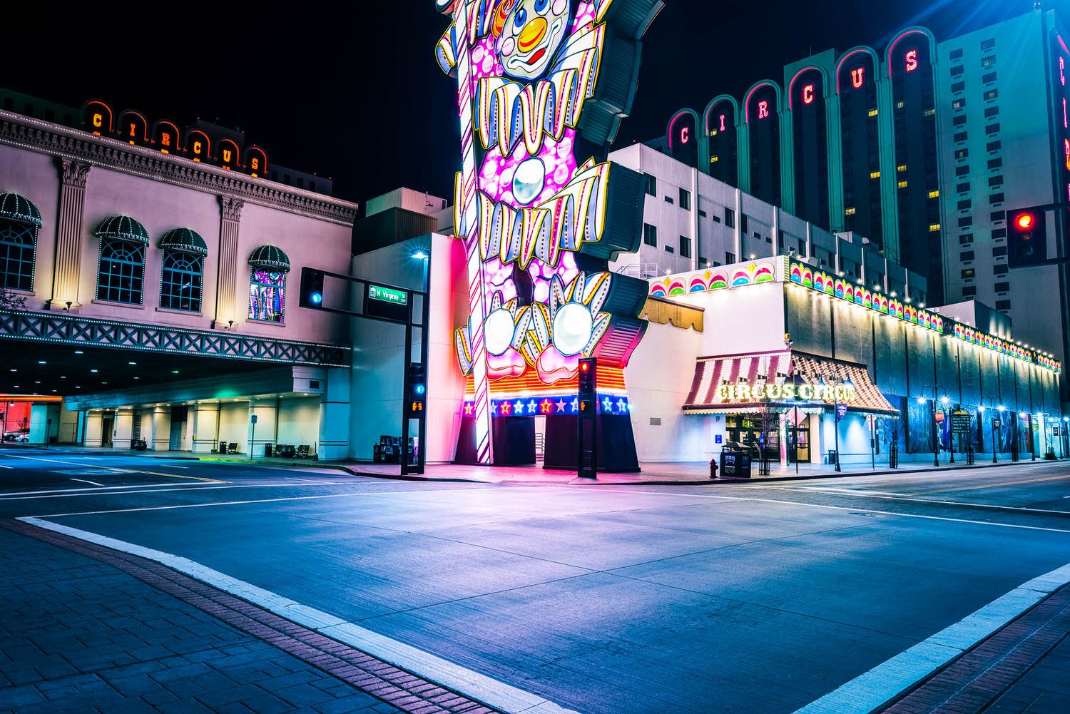
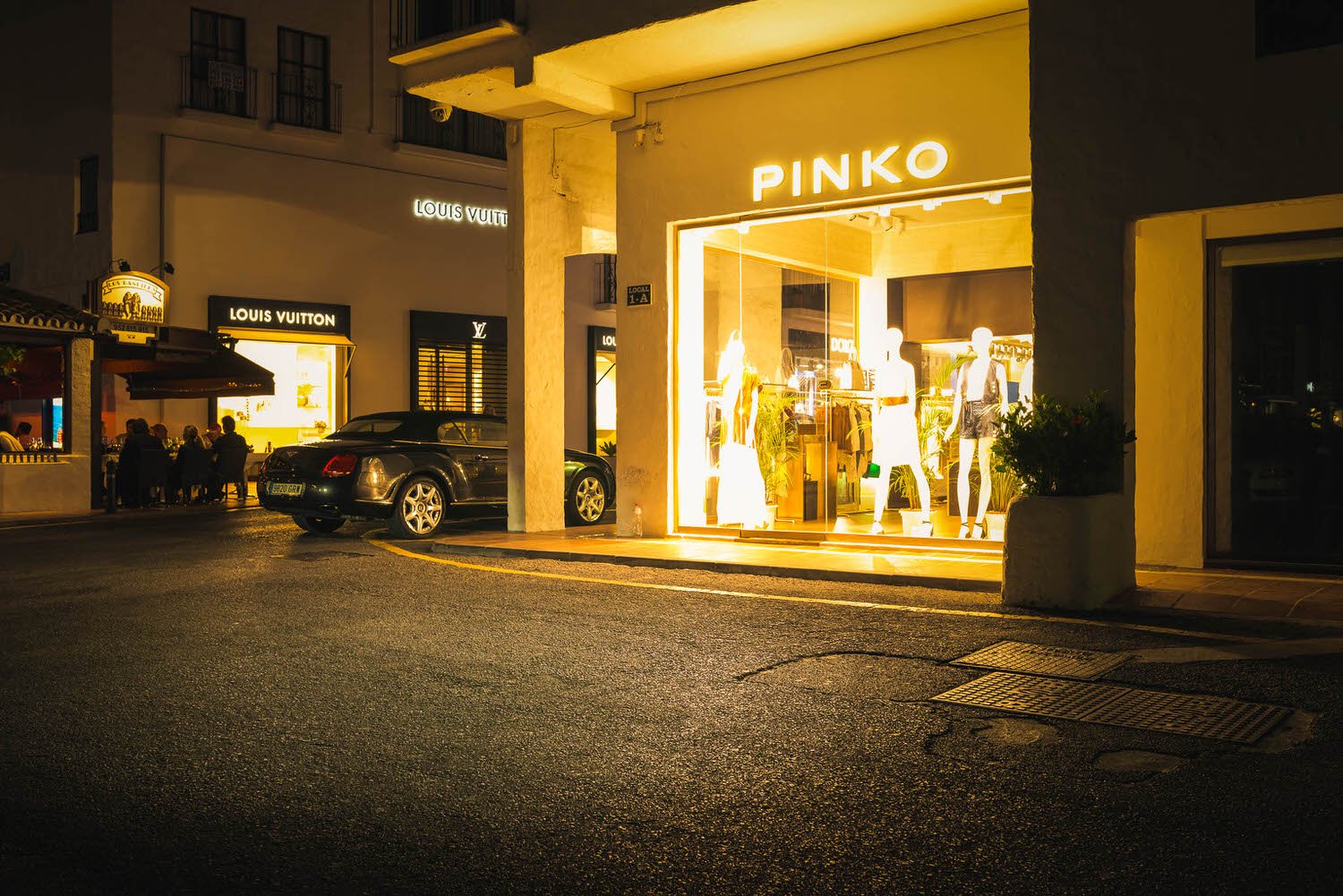
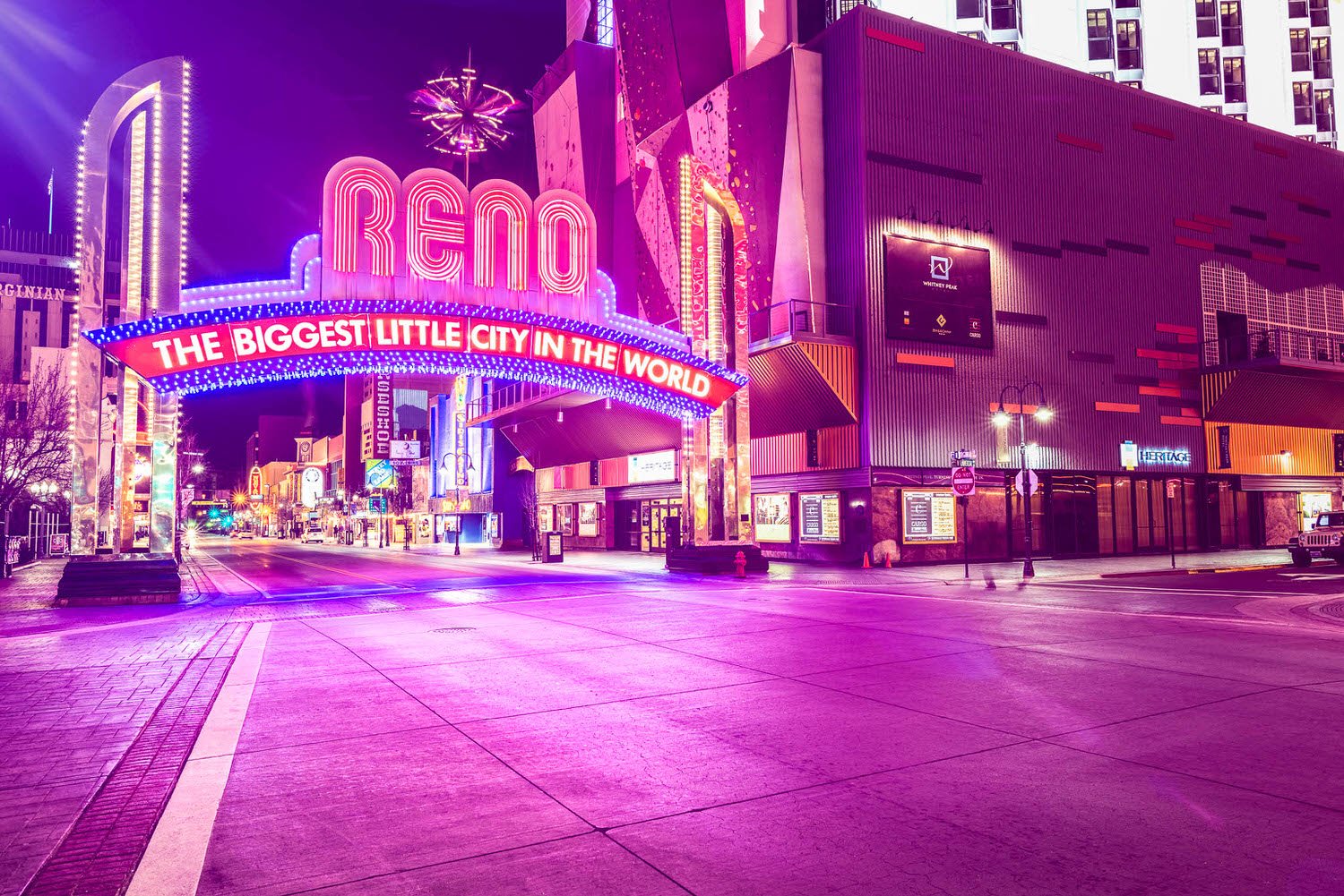
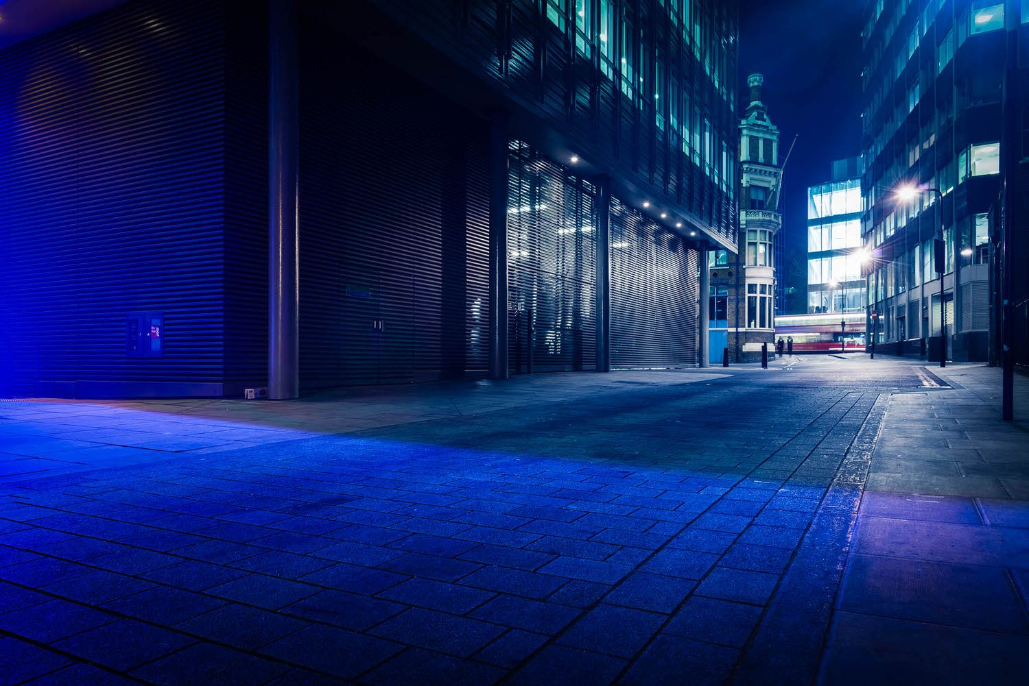
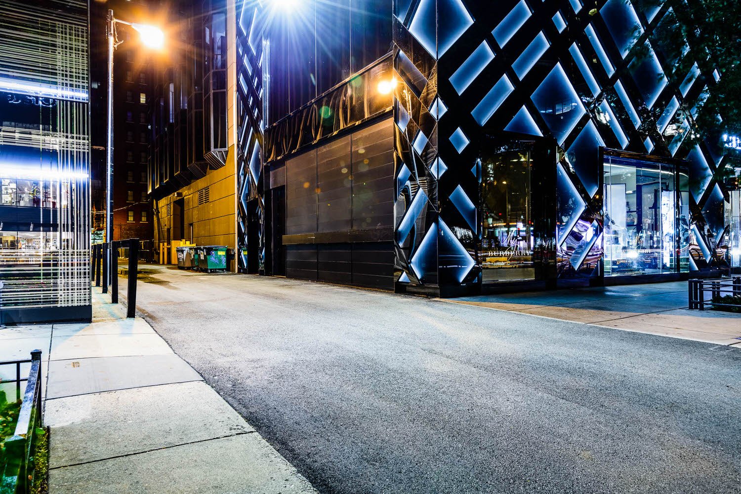
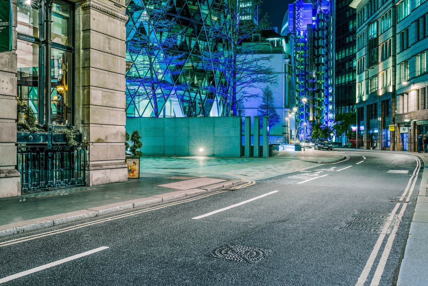
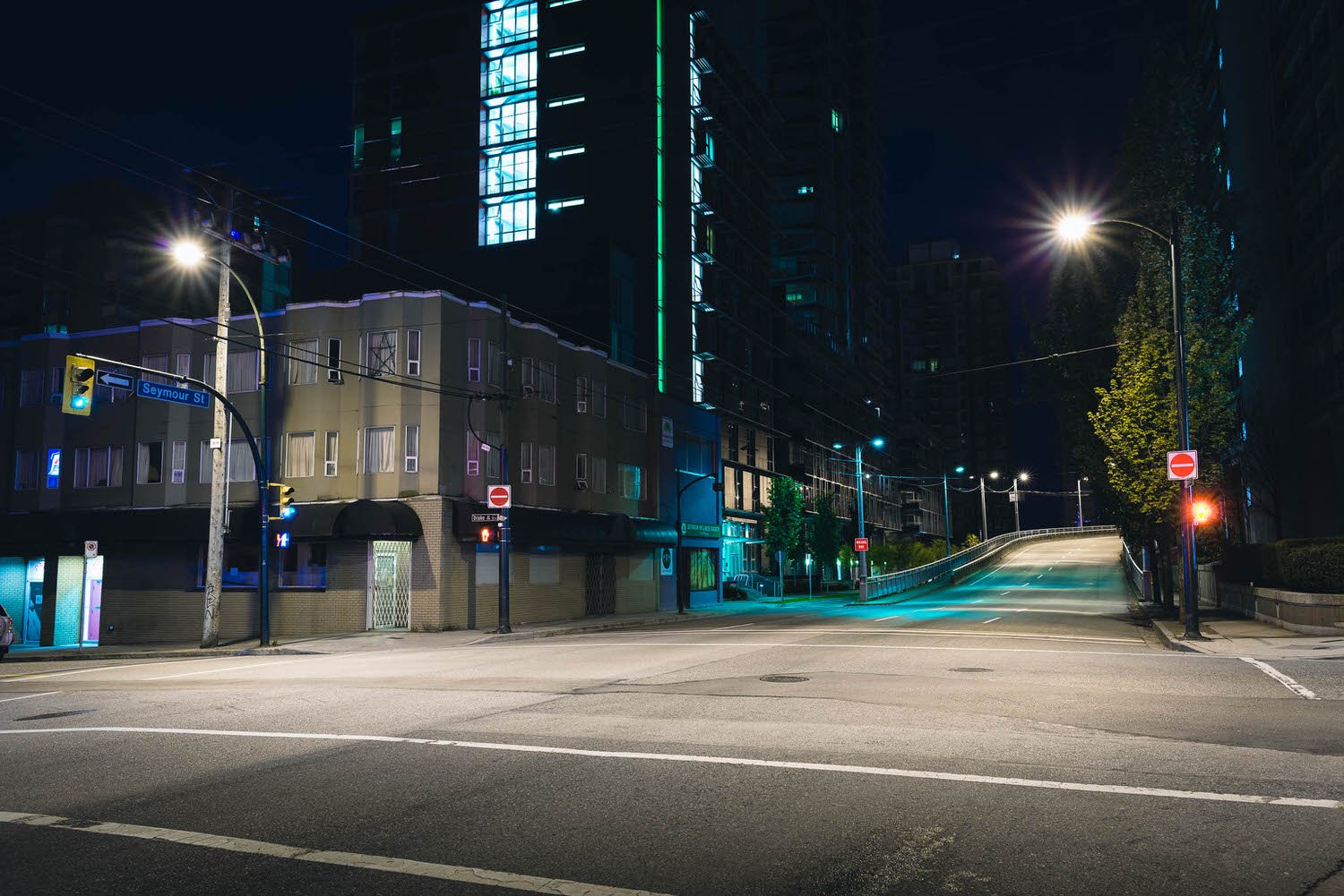
Neon Glow
The brief - Urban street illuminated with a colourful neon glow.

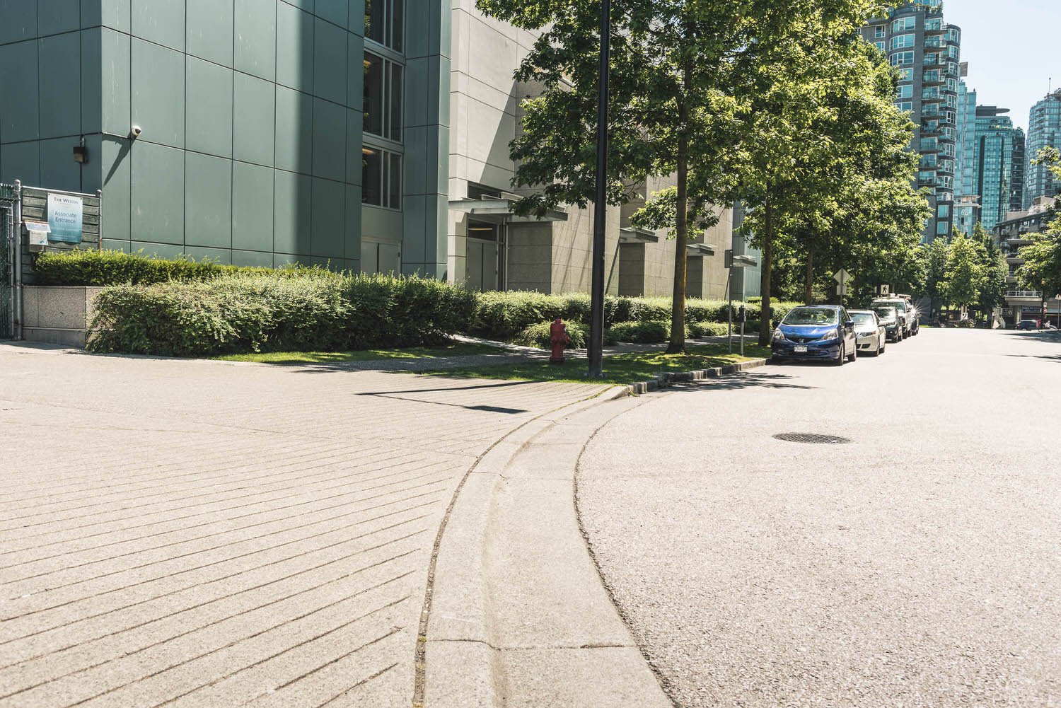
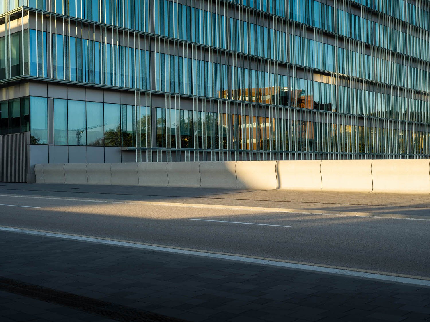
Just added
European city, plaza, city street & junctions.


This month’s editors choice has been hand picked by Simon
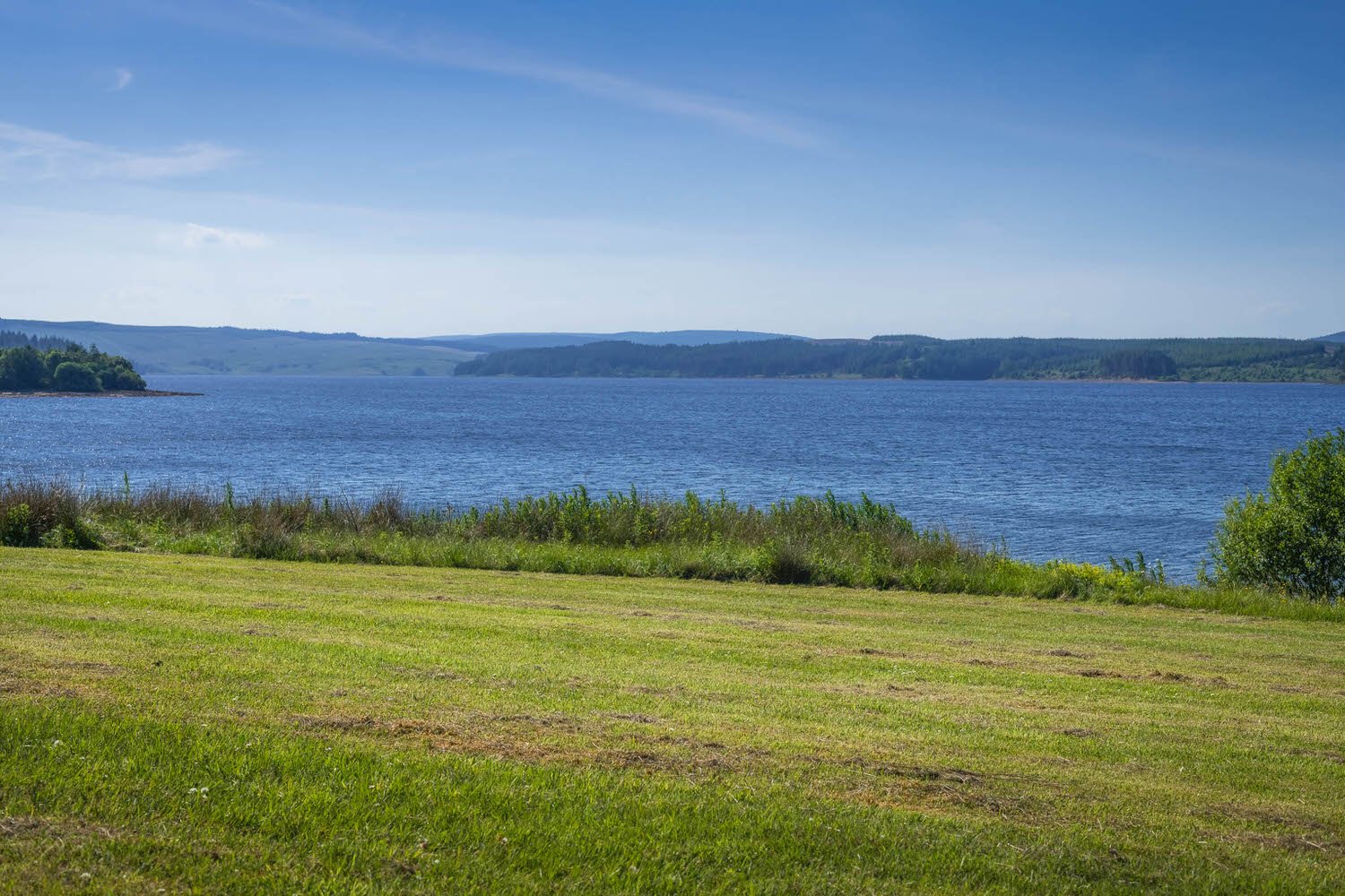
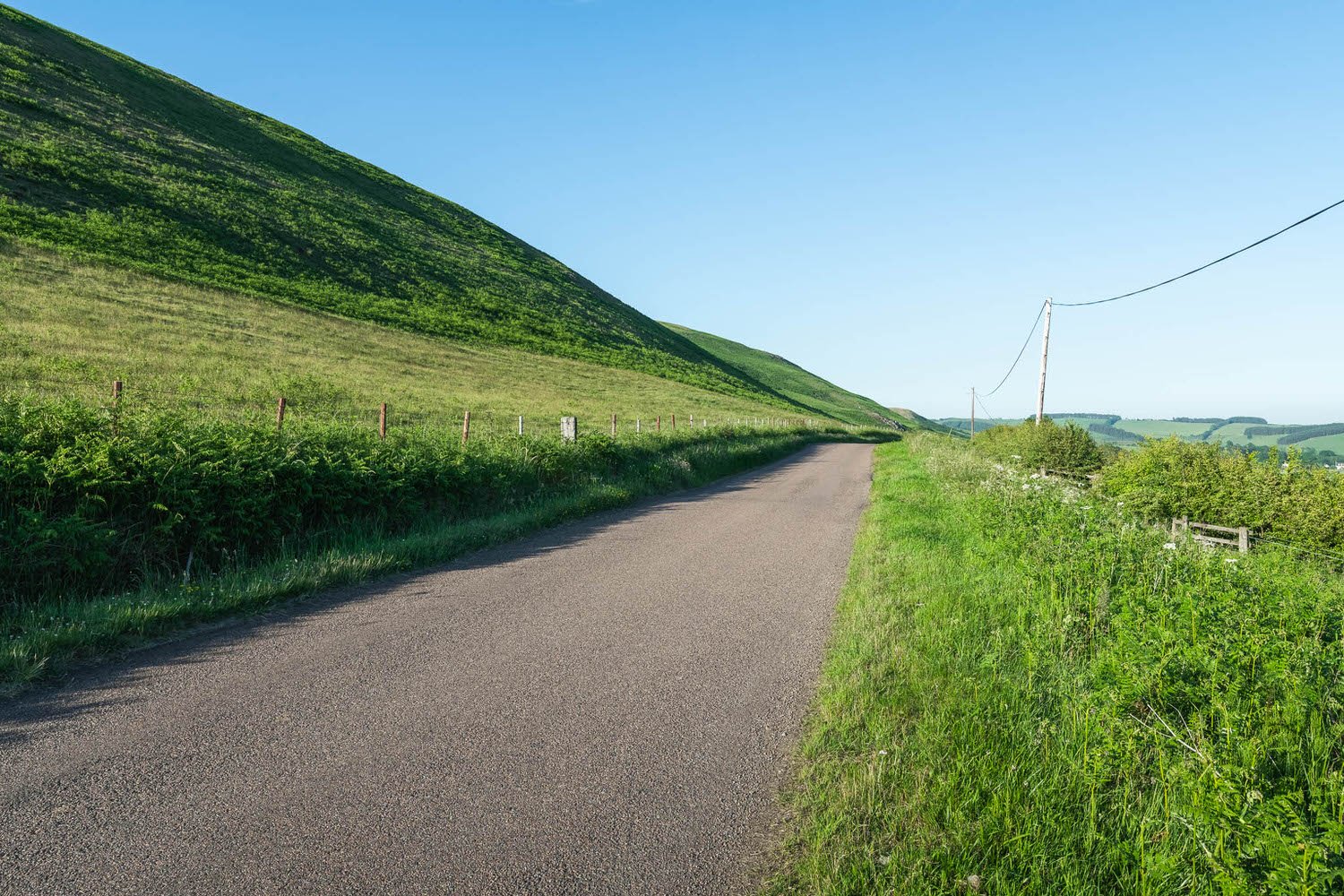
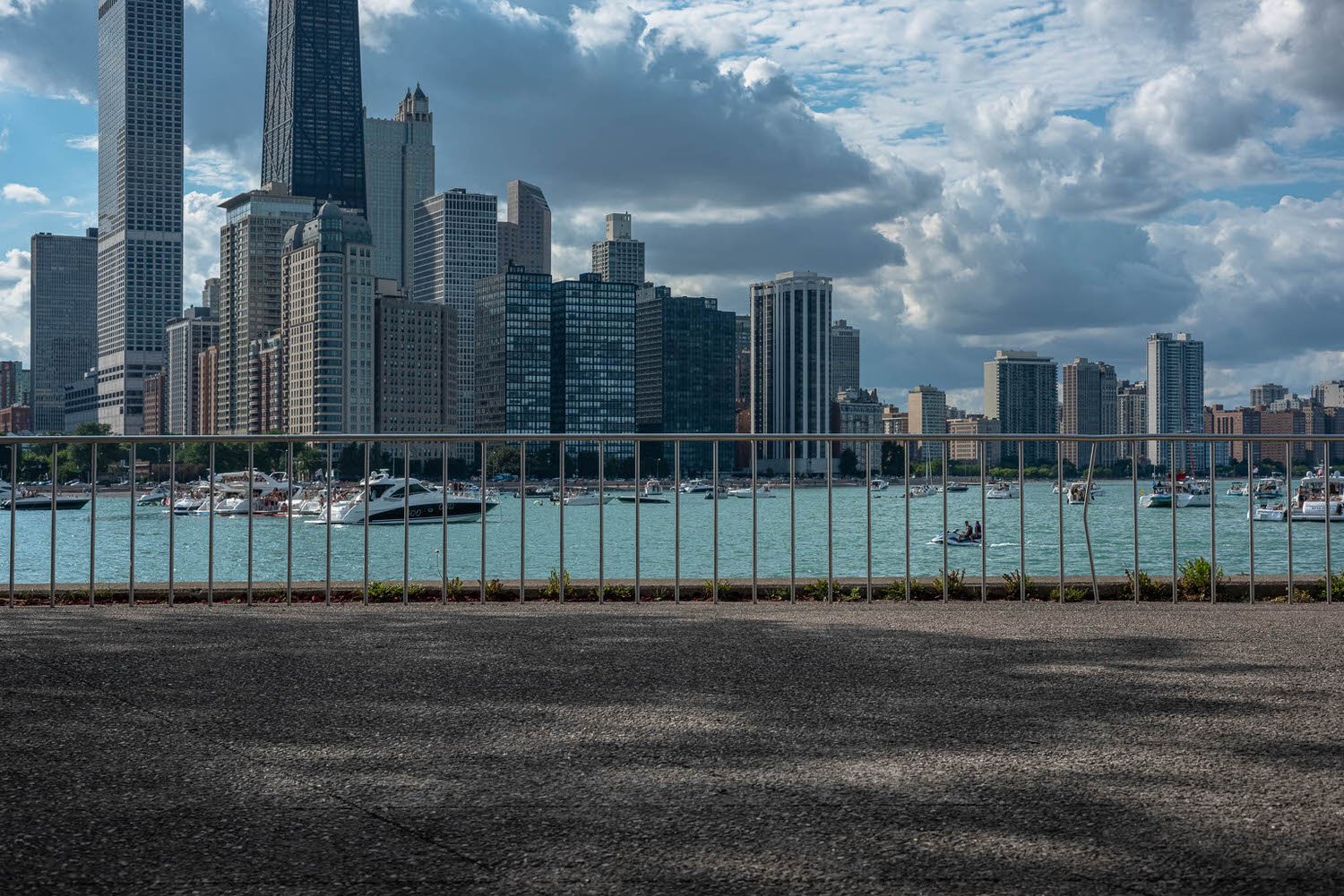
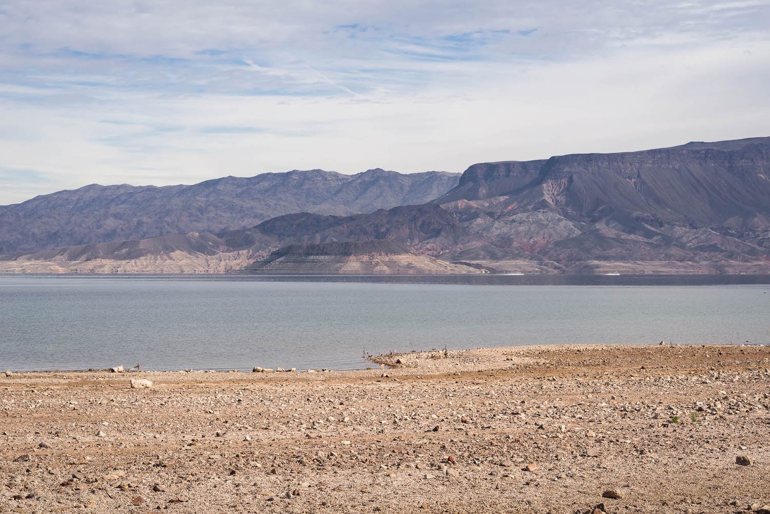
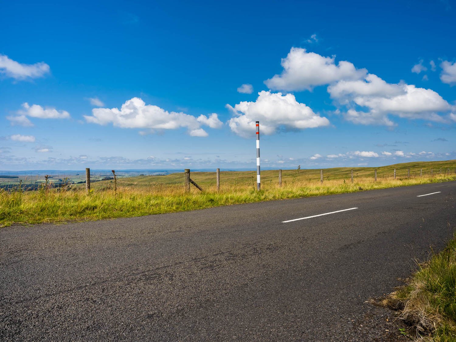
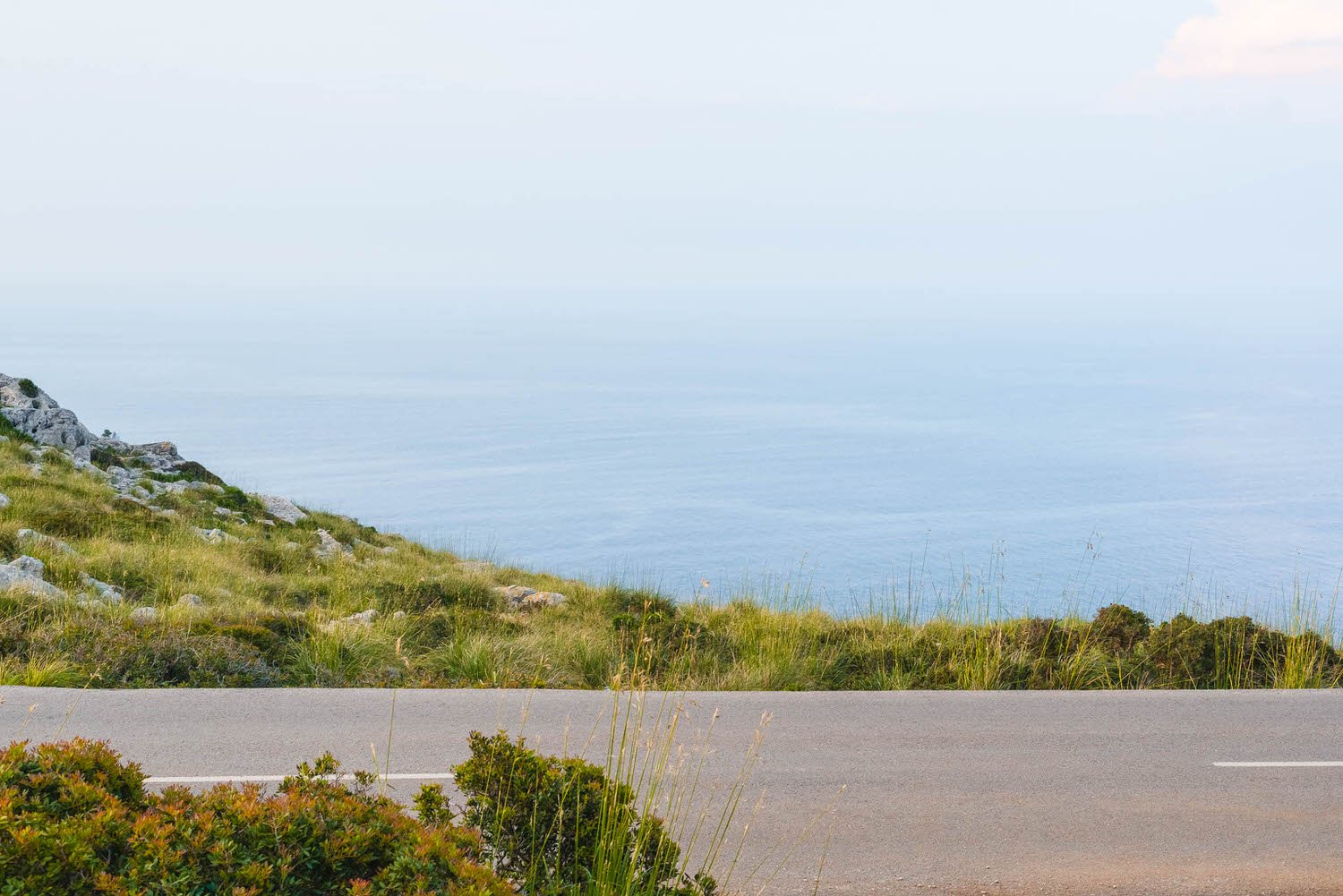
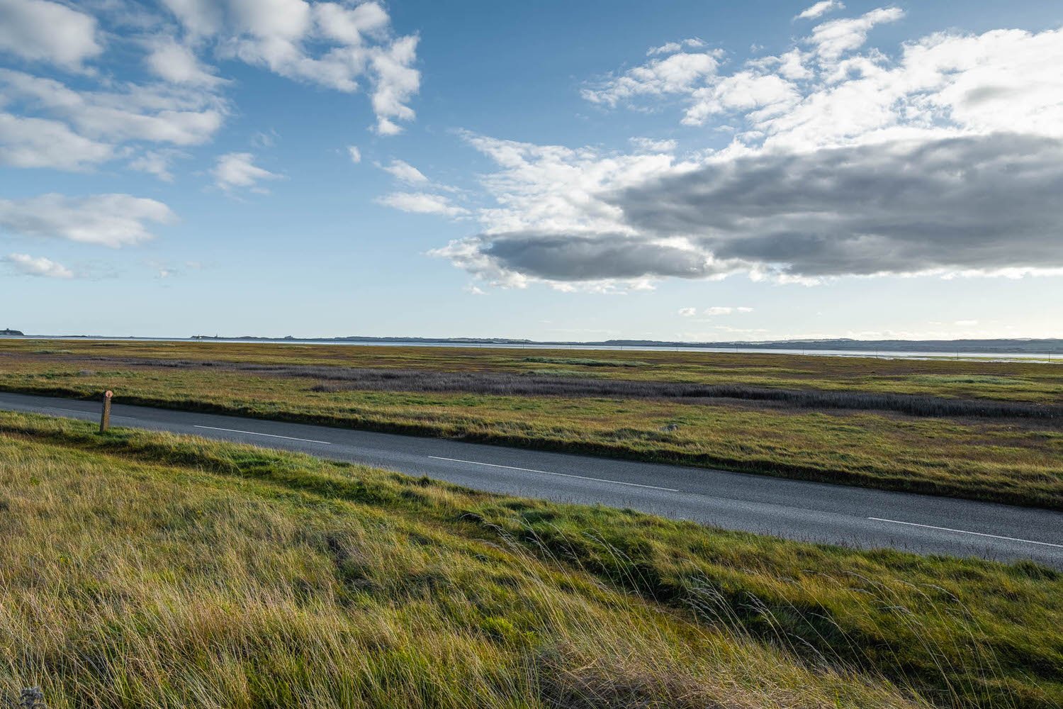
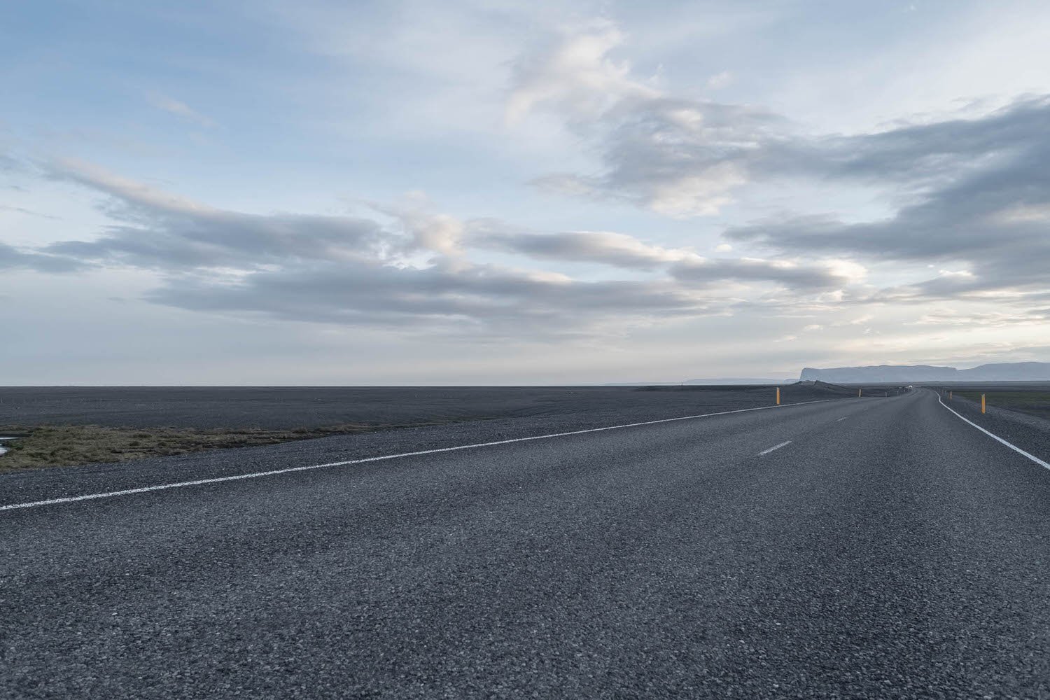
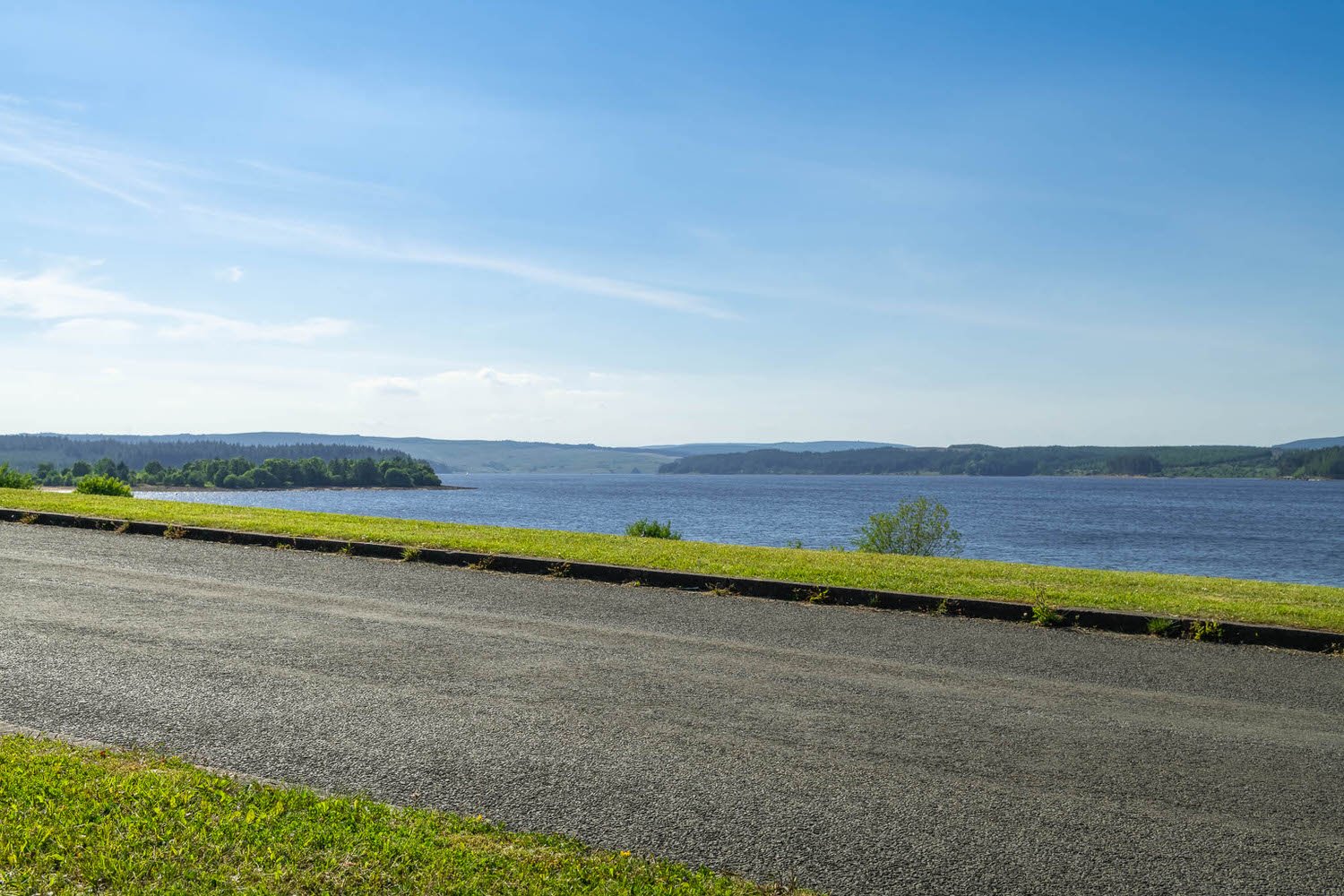
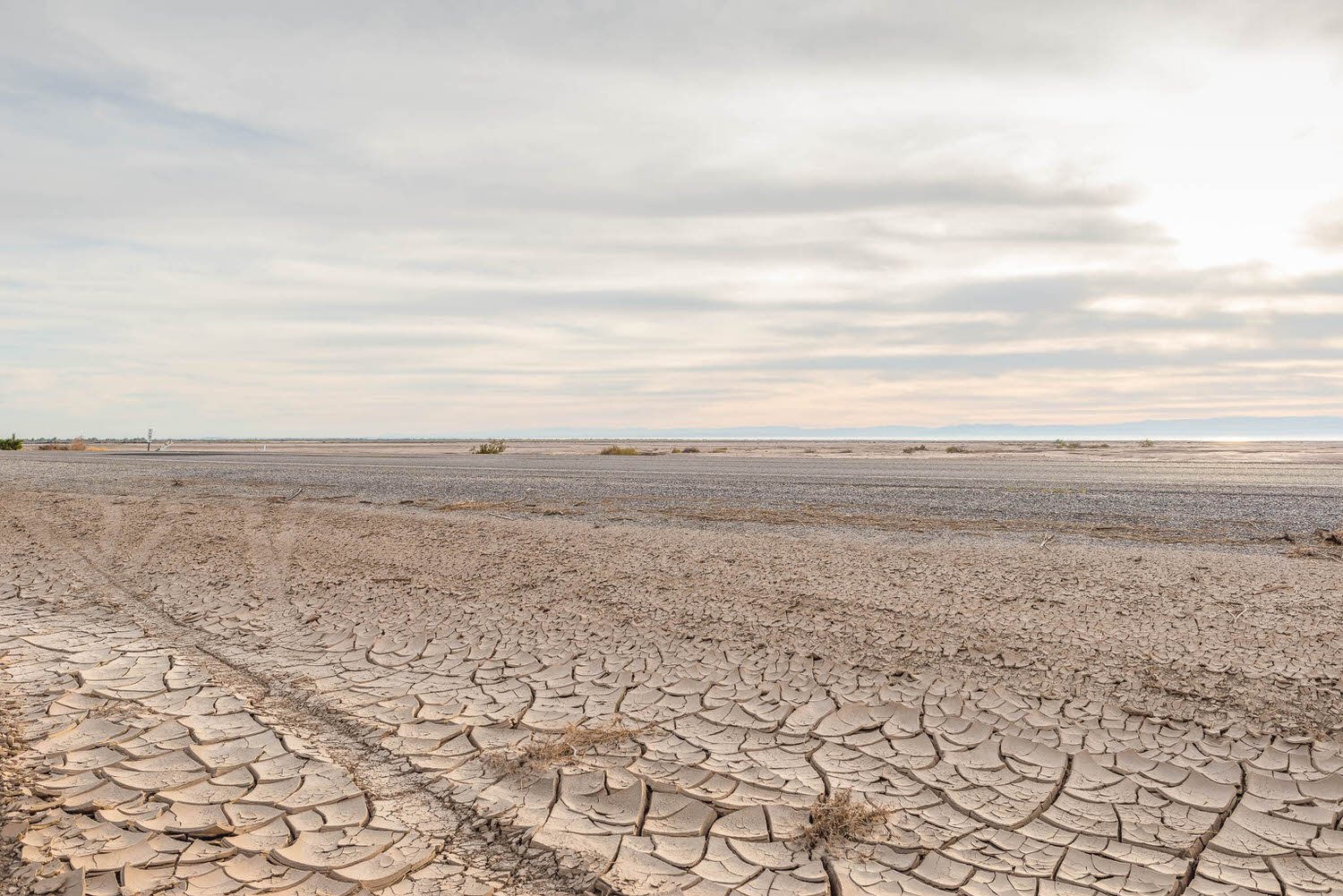
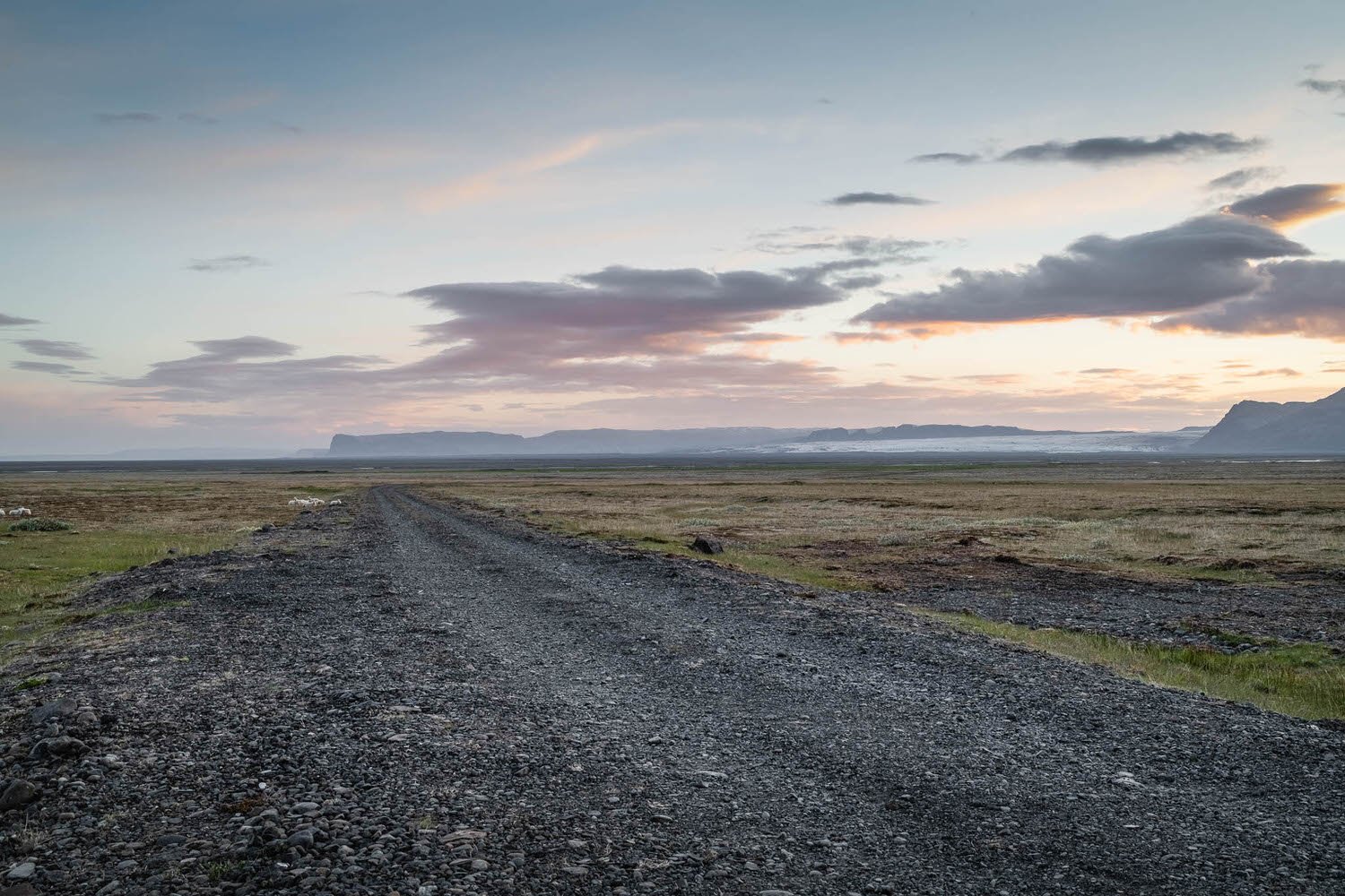
Half and Half
When scrolling through our imagery (a regular activity of mine), I noticed a large selection of images that had a very pleasing half and half visual split between the land/water and the sky. This bold layout is controversial to the ‘rule of thirds’ approach so popular in photography but creates an interesting visual effect nonetheless!

We know our imagery better than anyone. Send us your brief and we'll put together a lightbox for you.
Register now for Premium Access, non-watermarked downloads, tailored pricing and a more personalised service.
We've organised hundreds of collections to make finding the right image easy, no matter how specific.